Banana Cafe
Banana Cafe is a new coffee shop (2020) that is located in Gangnam, South Korea. The cafe was made for 18-30 year-olds, friend groups, and classmates who need a place to meet, hang out, chat, or study together. At this coffee shop, friends could meet without being in close proximity to strangers. Rooms/slots are separated from the others, allowing people to have privacy and not be distracted by outside noise. Customers can order from inside and the order will arrive without server-to-consumer contact. The cafe also only sells banana products. Inside, the mood is bright and has a light tint of banana scent (banana bread).
Direction 1
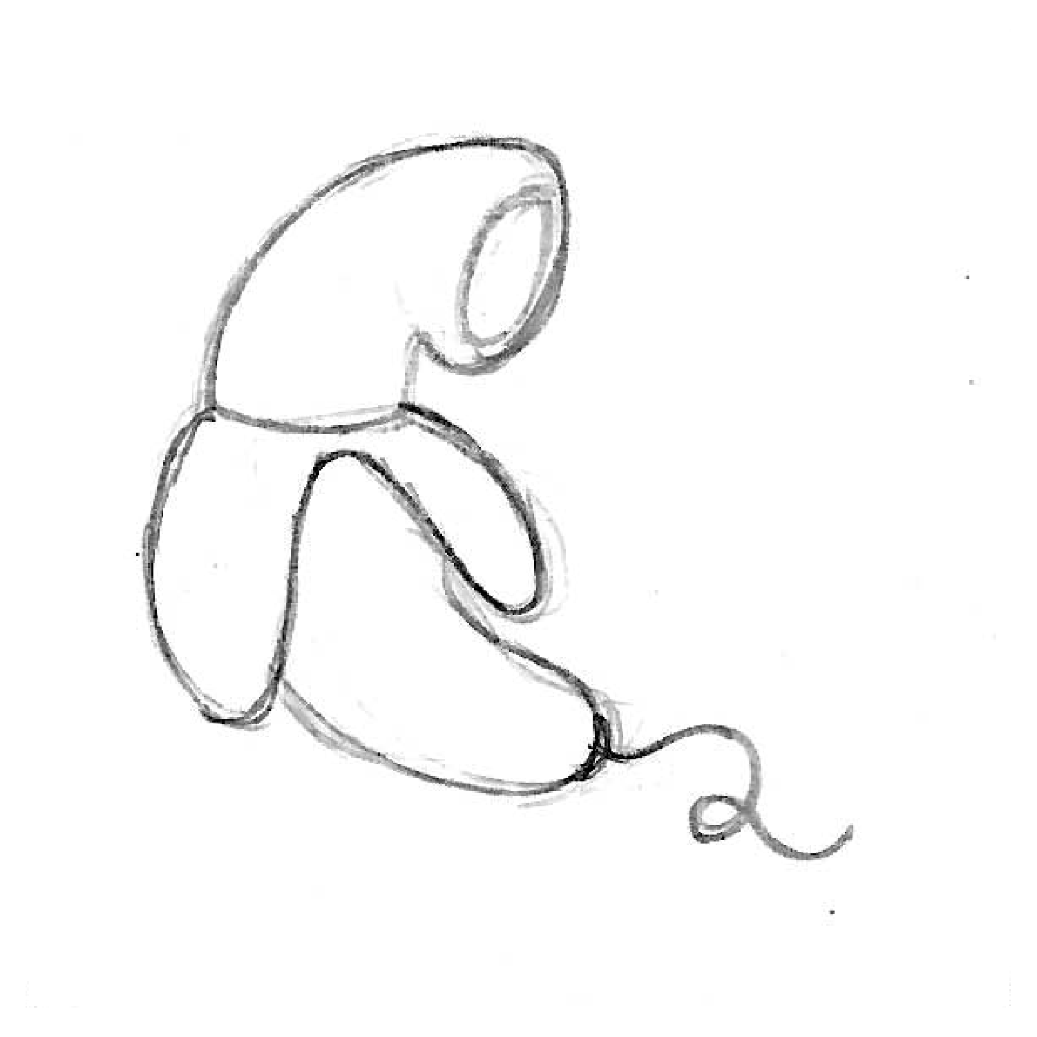
Direction 1 plays with the concept of isolation and privacy.
Direction 2
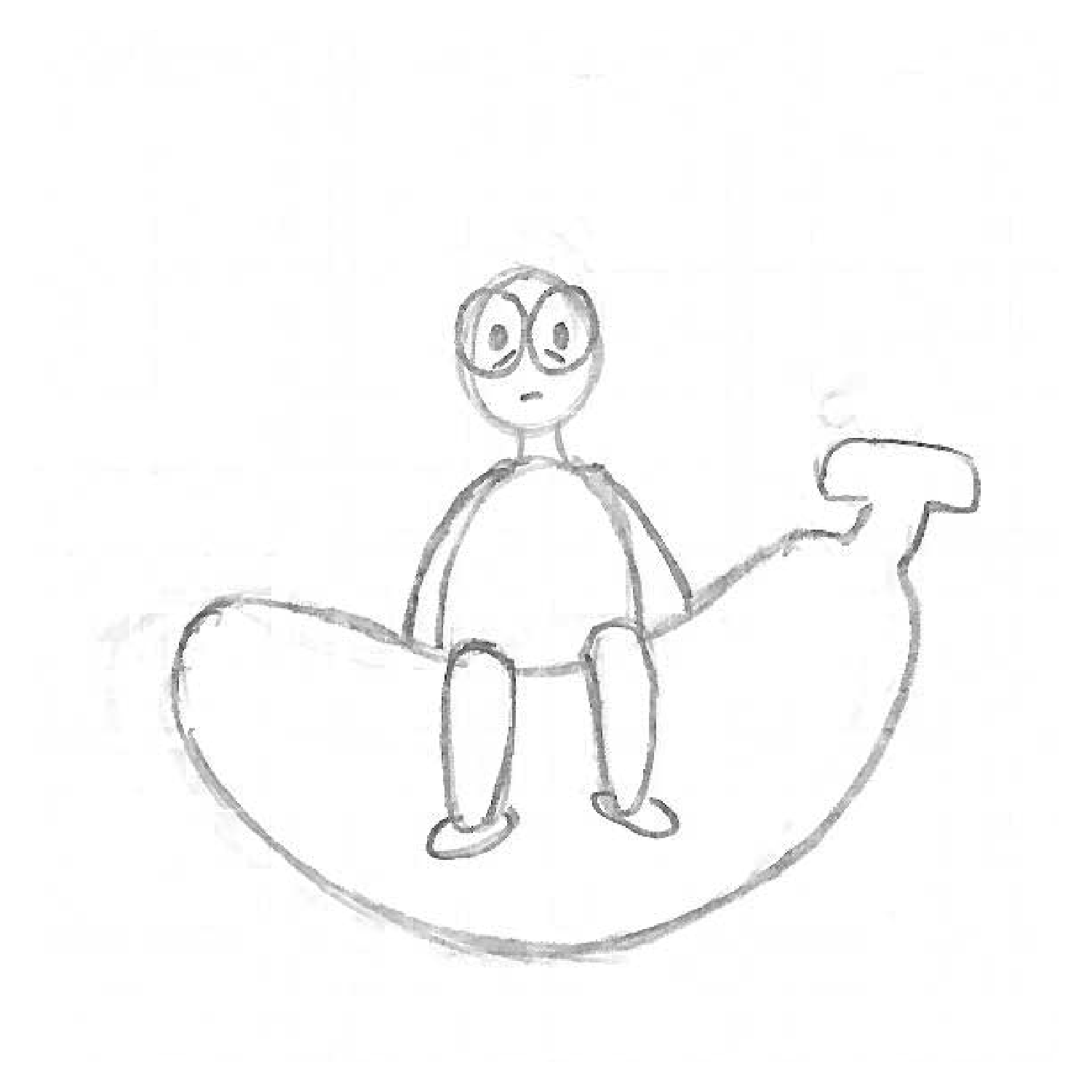
Direction 2 focuses on the “recharging” element bananas provide.
RESEARCH & INITIAL IDEAS
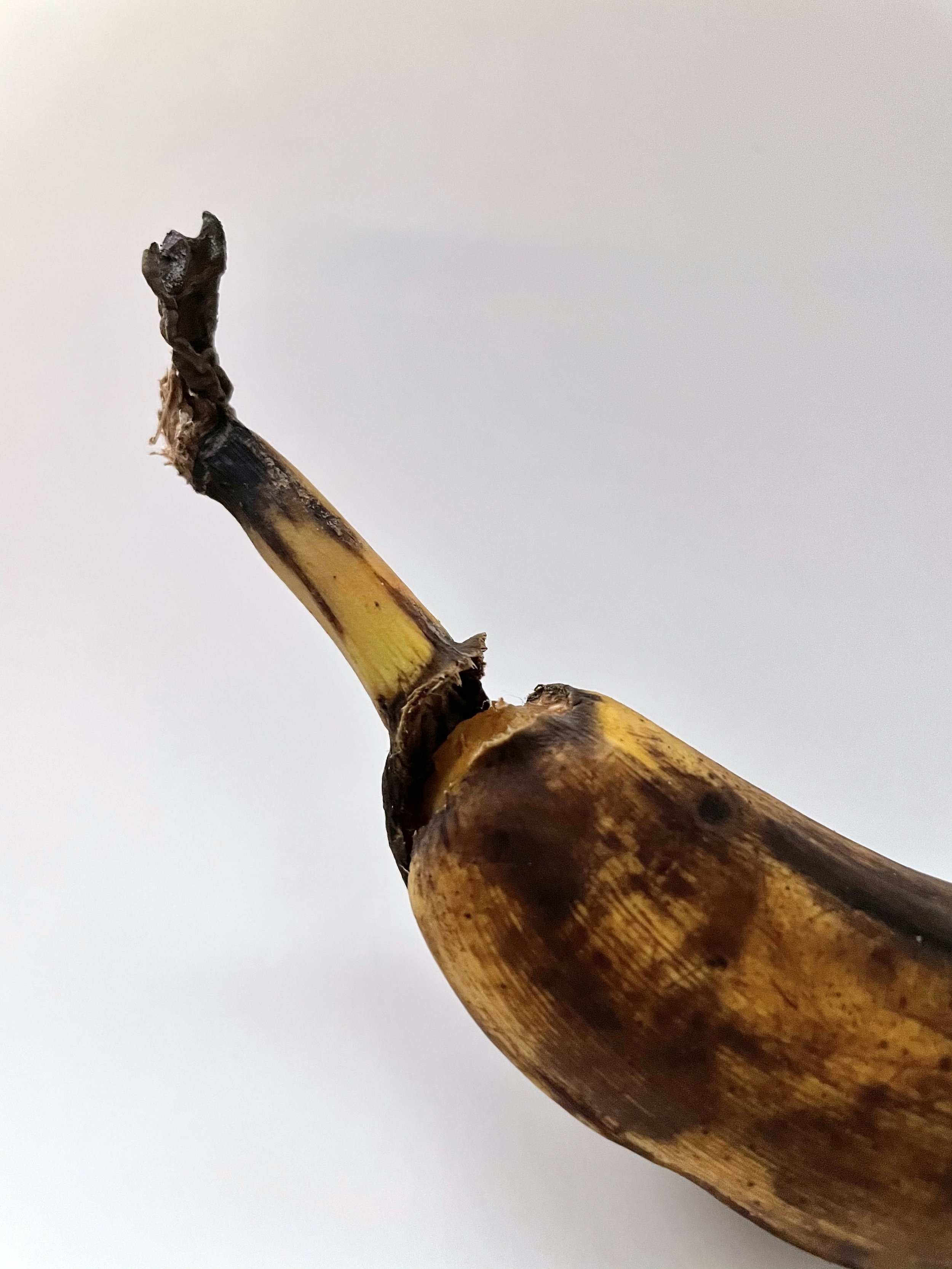
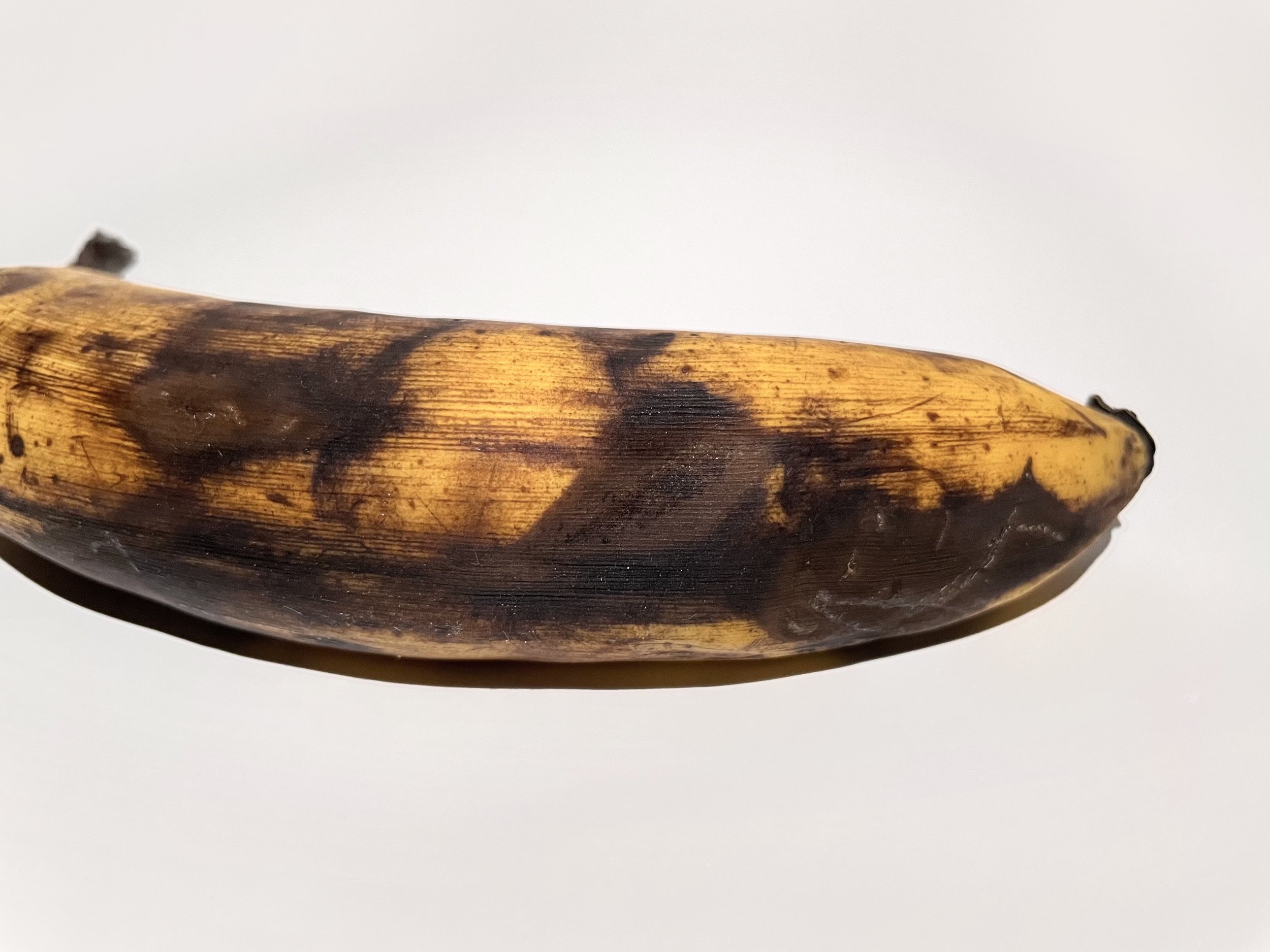
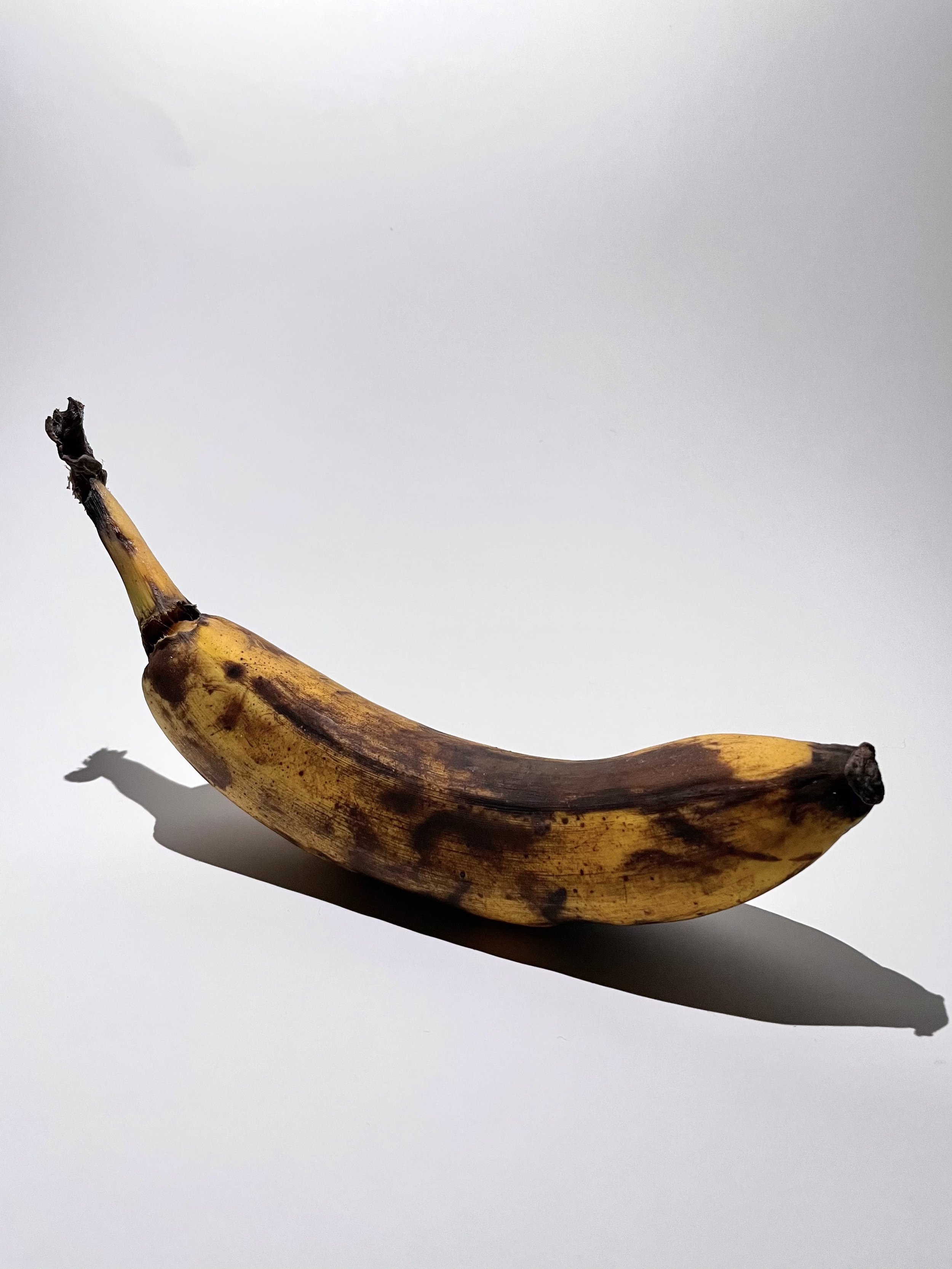
In the beginning stages, I photographed a banana and researched its unique qualities. I found the stem to be a unique shape that helps differentiate them from other fruits, they have a curved/long body, they change from green to brown, and their peels contain serotonin and norepinephrine, which makes people feel happier. I wanted to focus on these elements and draw out a mind graph to get inspiration for my design direction.
From the mind map, I picked keywords, such as isolation, energy, and curved to develop a moodboard. The moodboard is filled with soft, curved, pastel, and energetic, images that resonate with the qualities of a banana in a modern and architectural way. I used this board to guide my design decisions throughout the sketching to the final phase.
LOGO
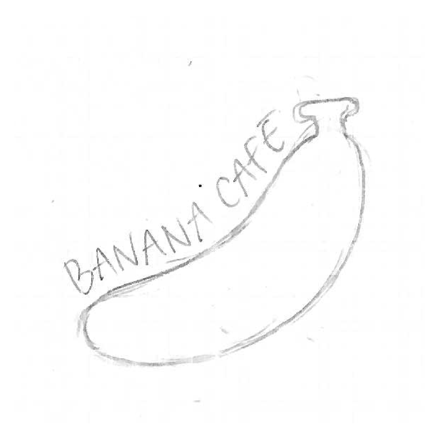
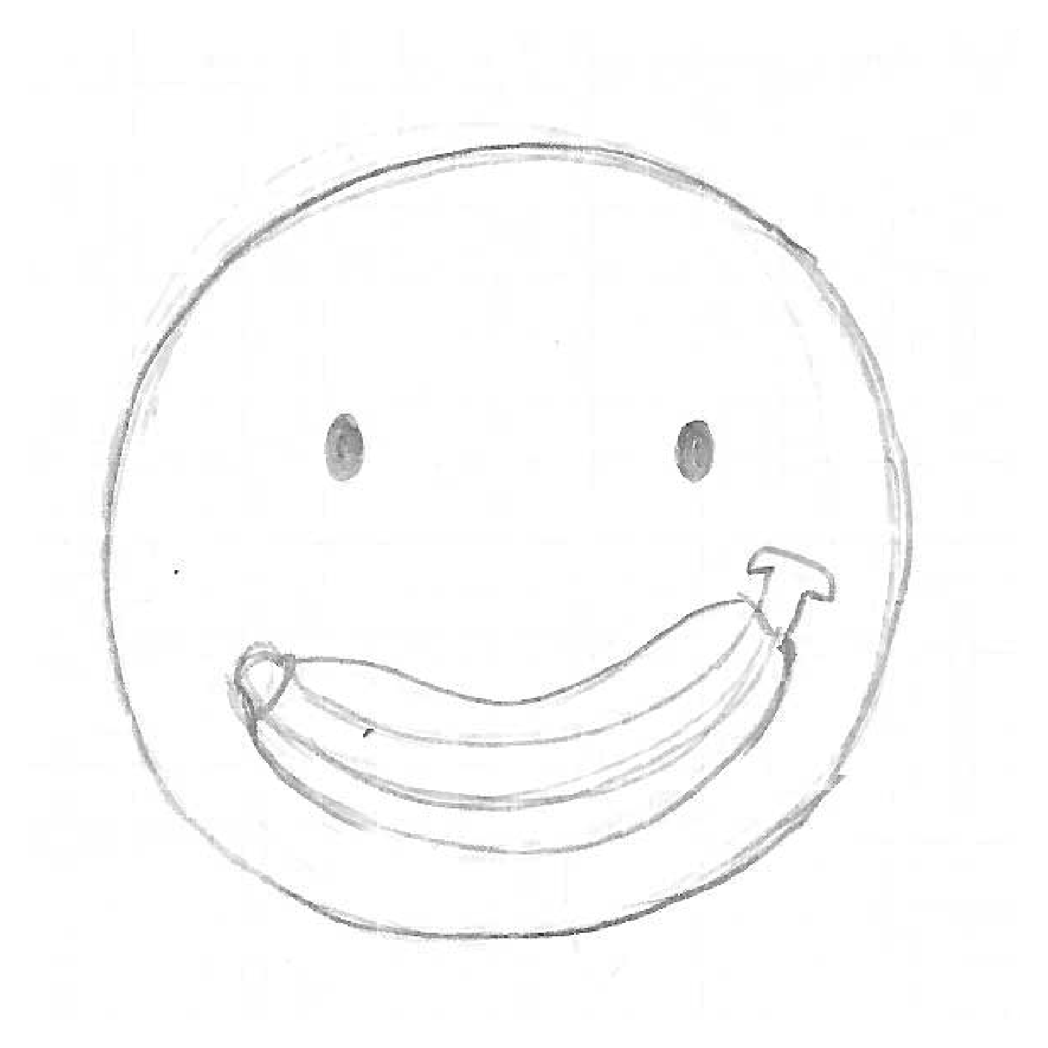
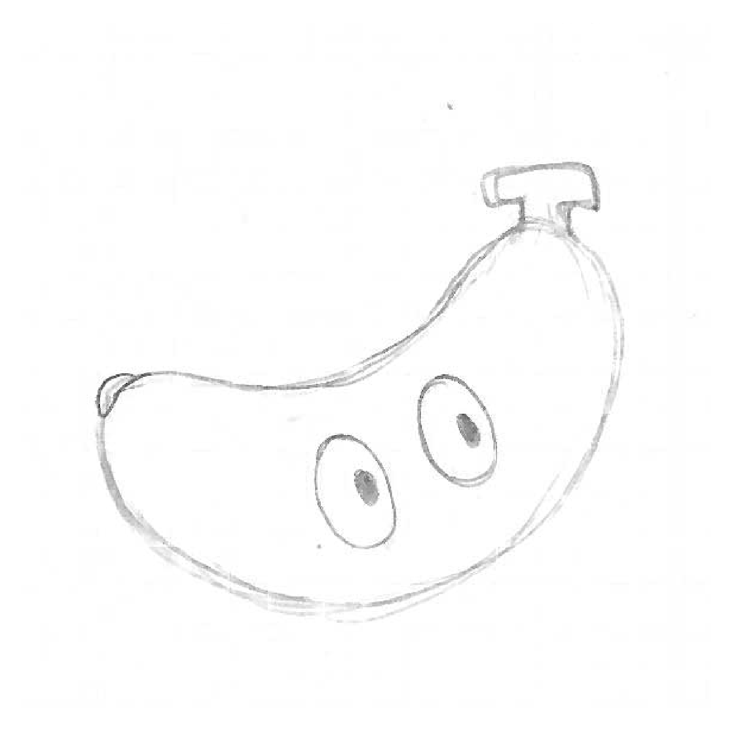
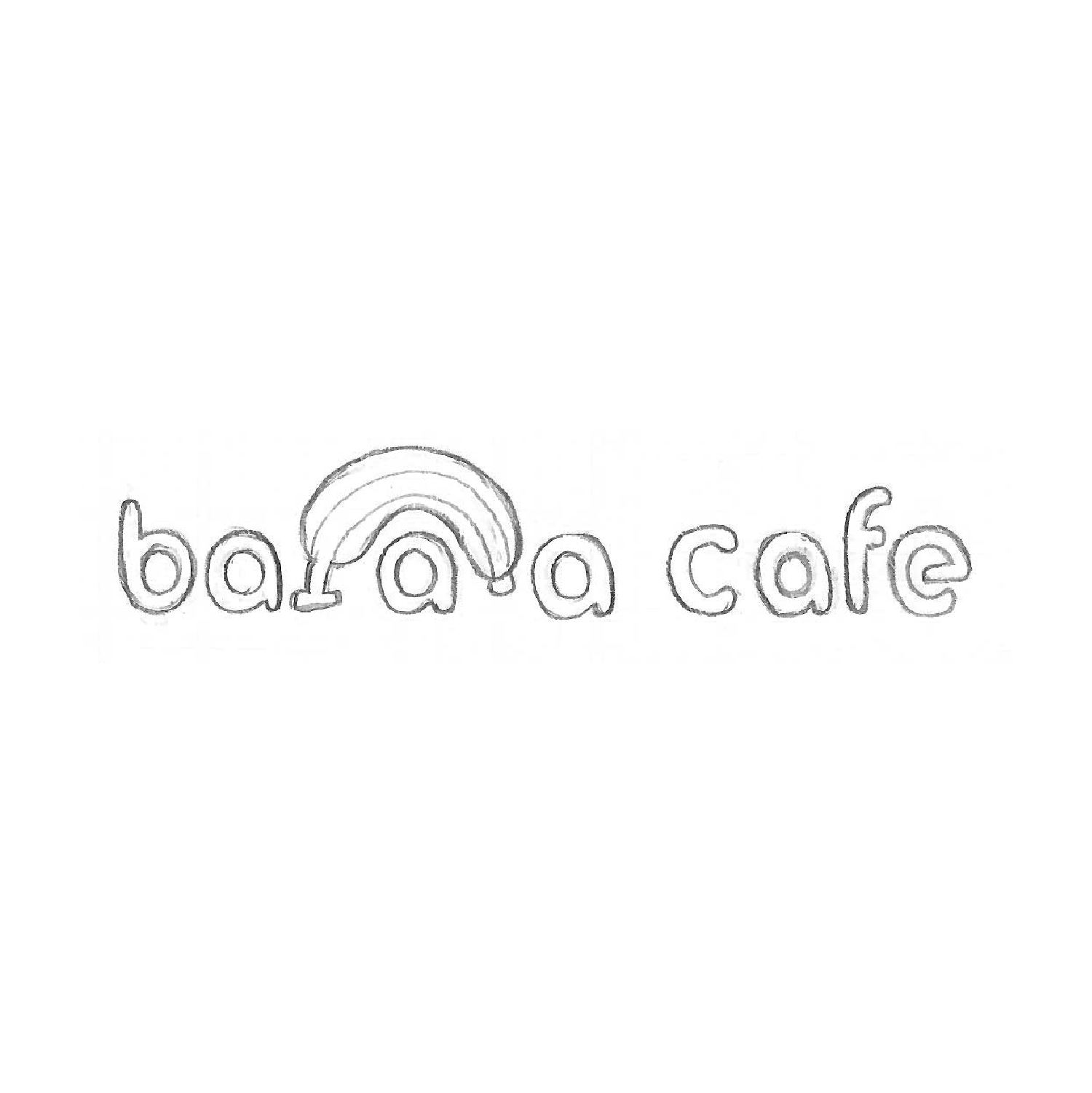
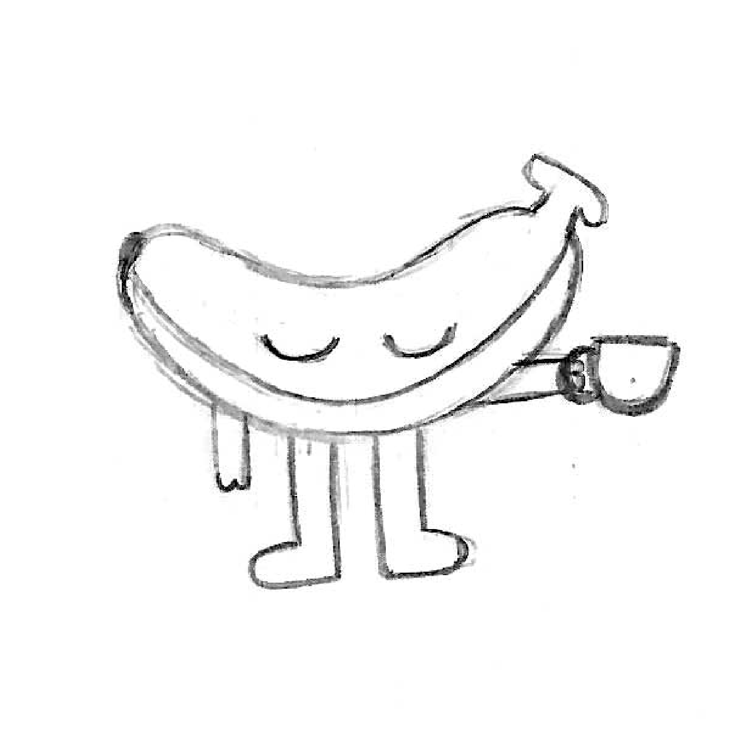
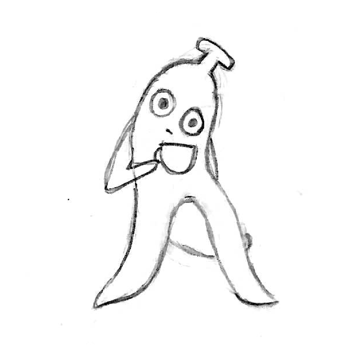
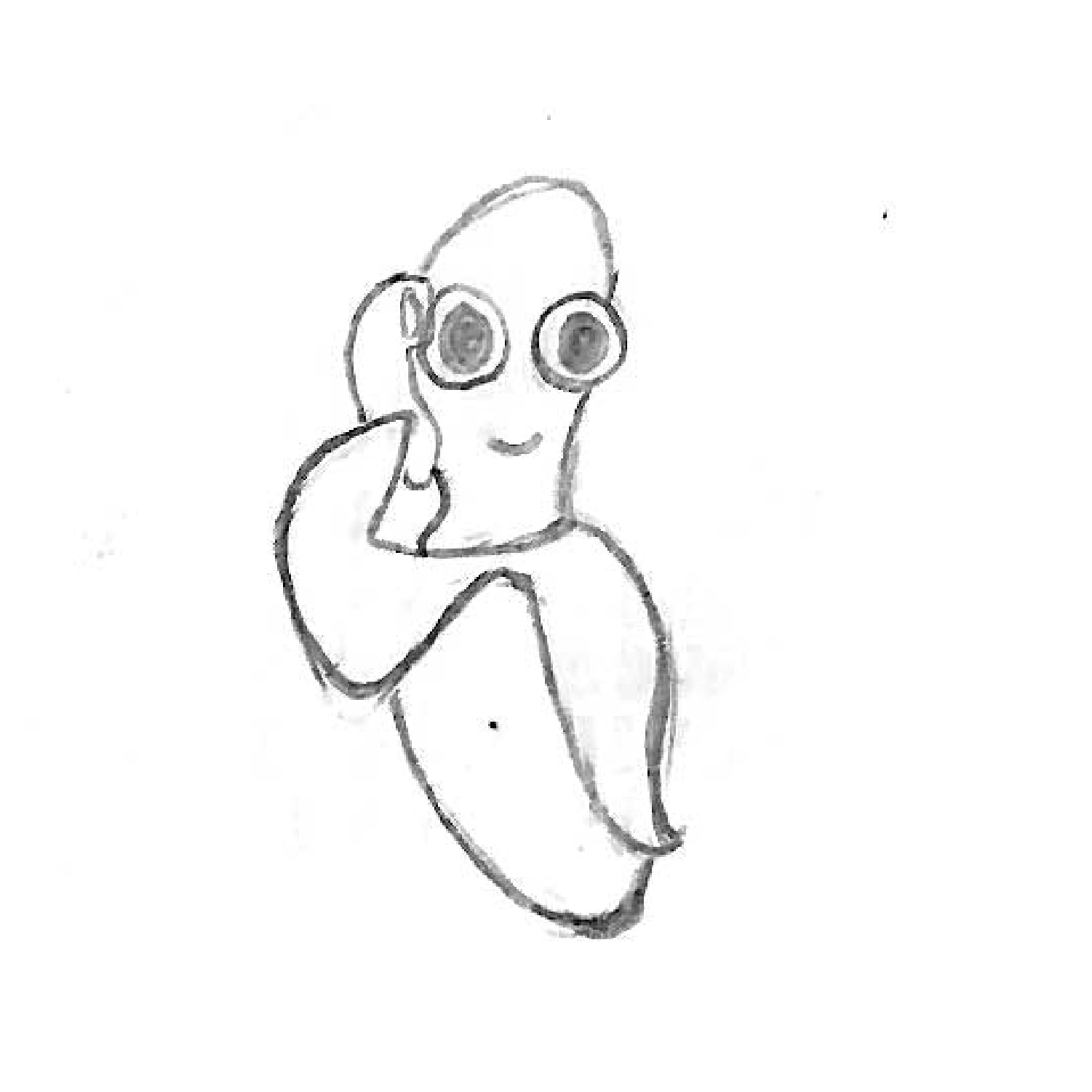
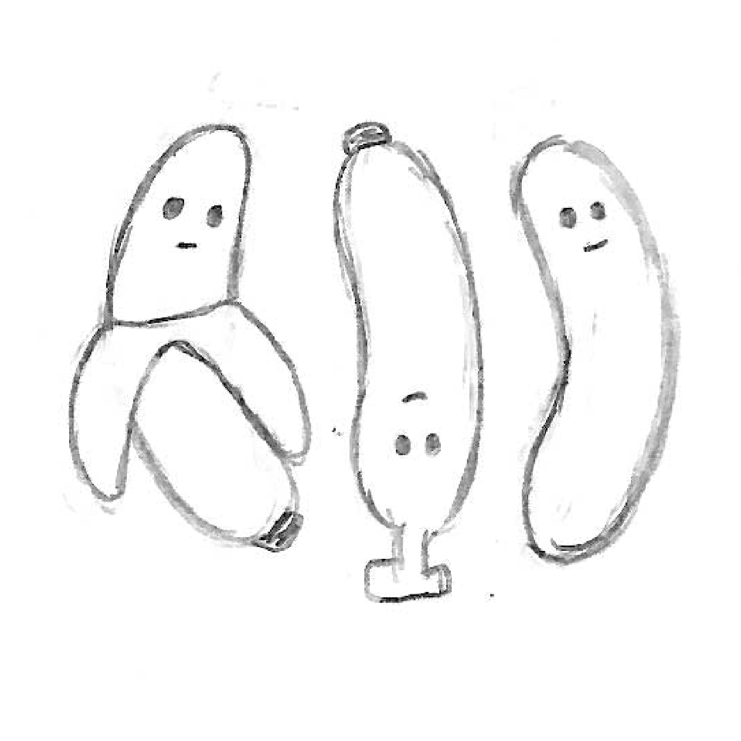
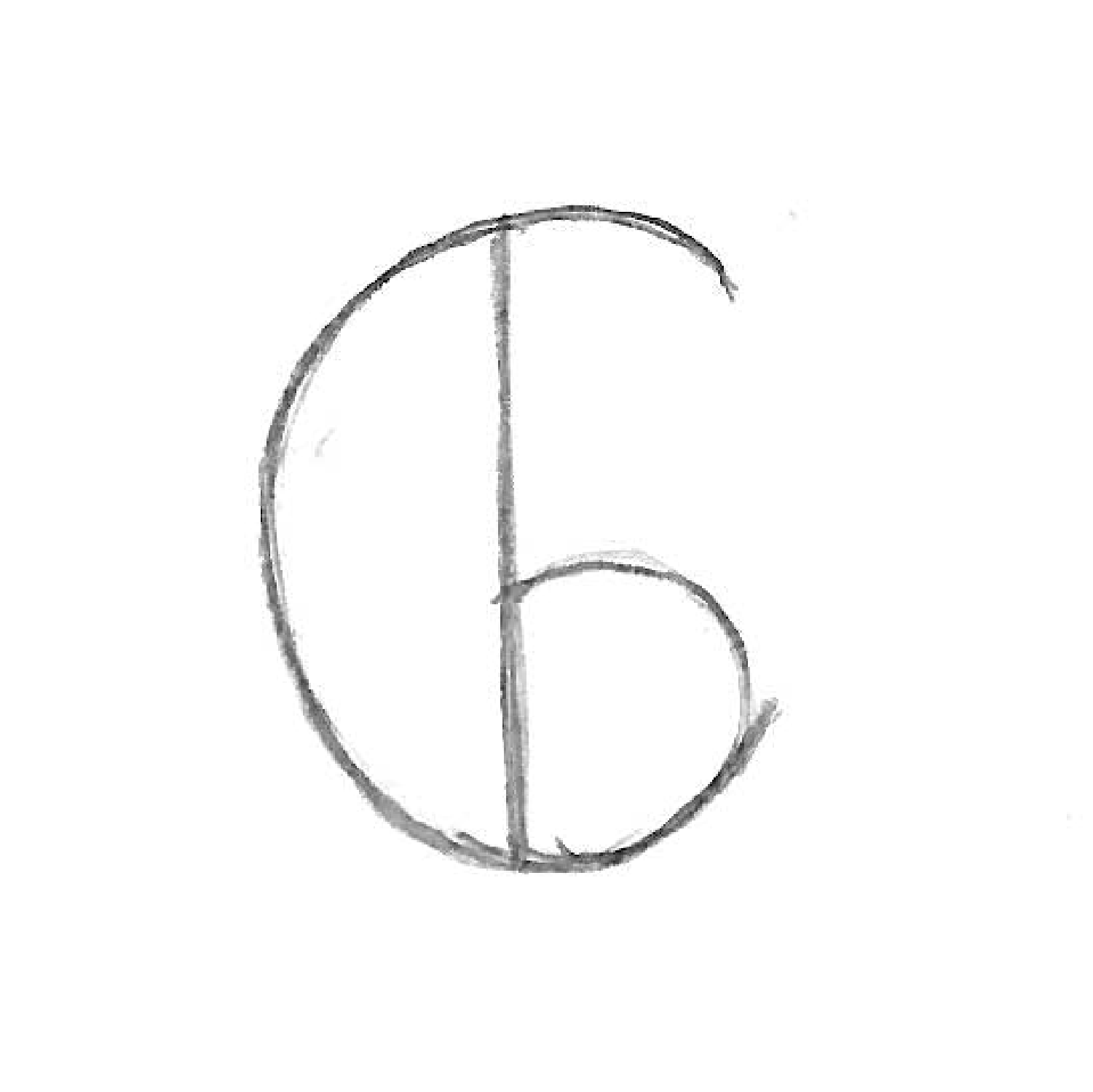
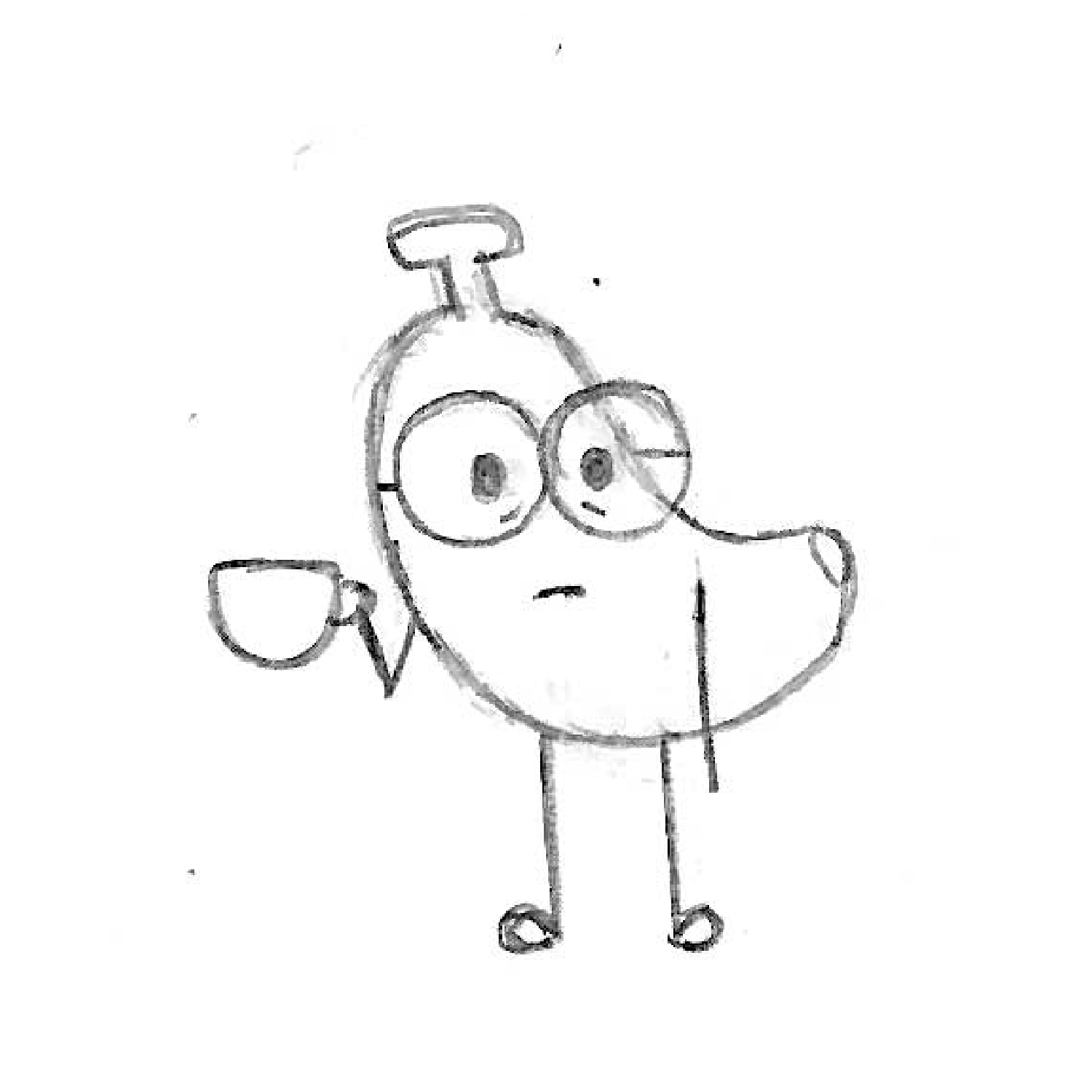
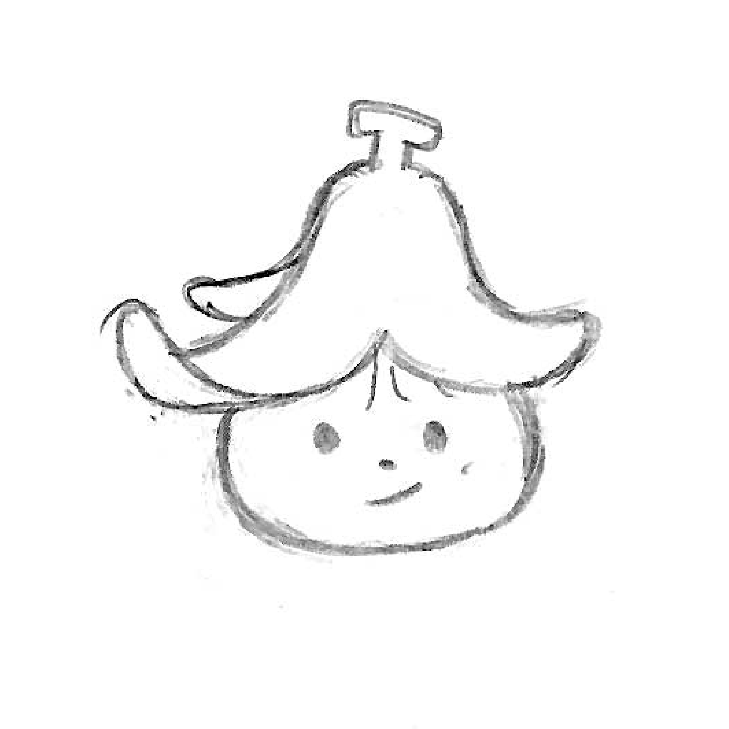
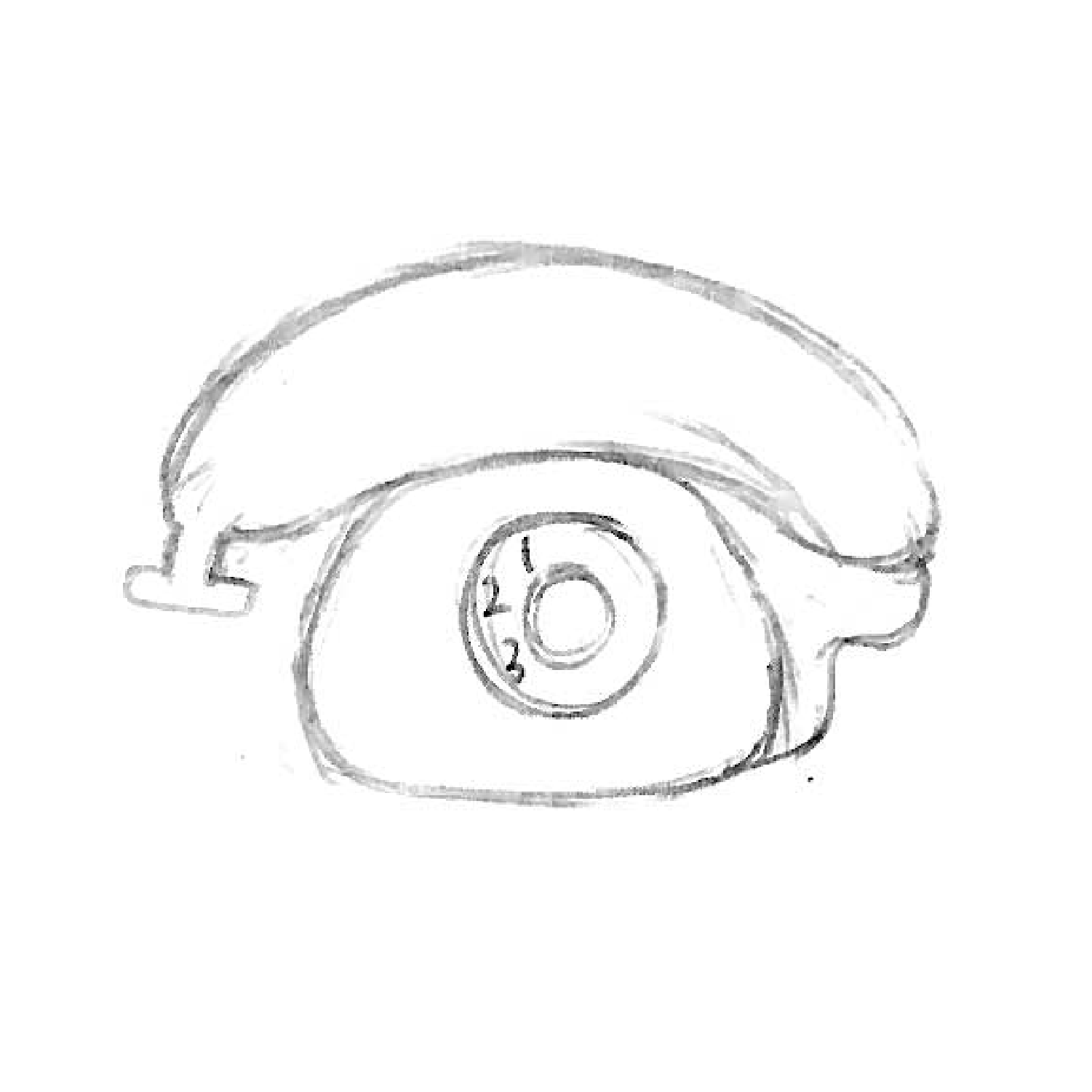
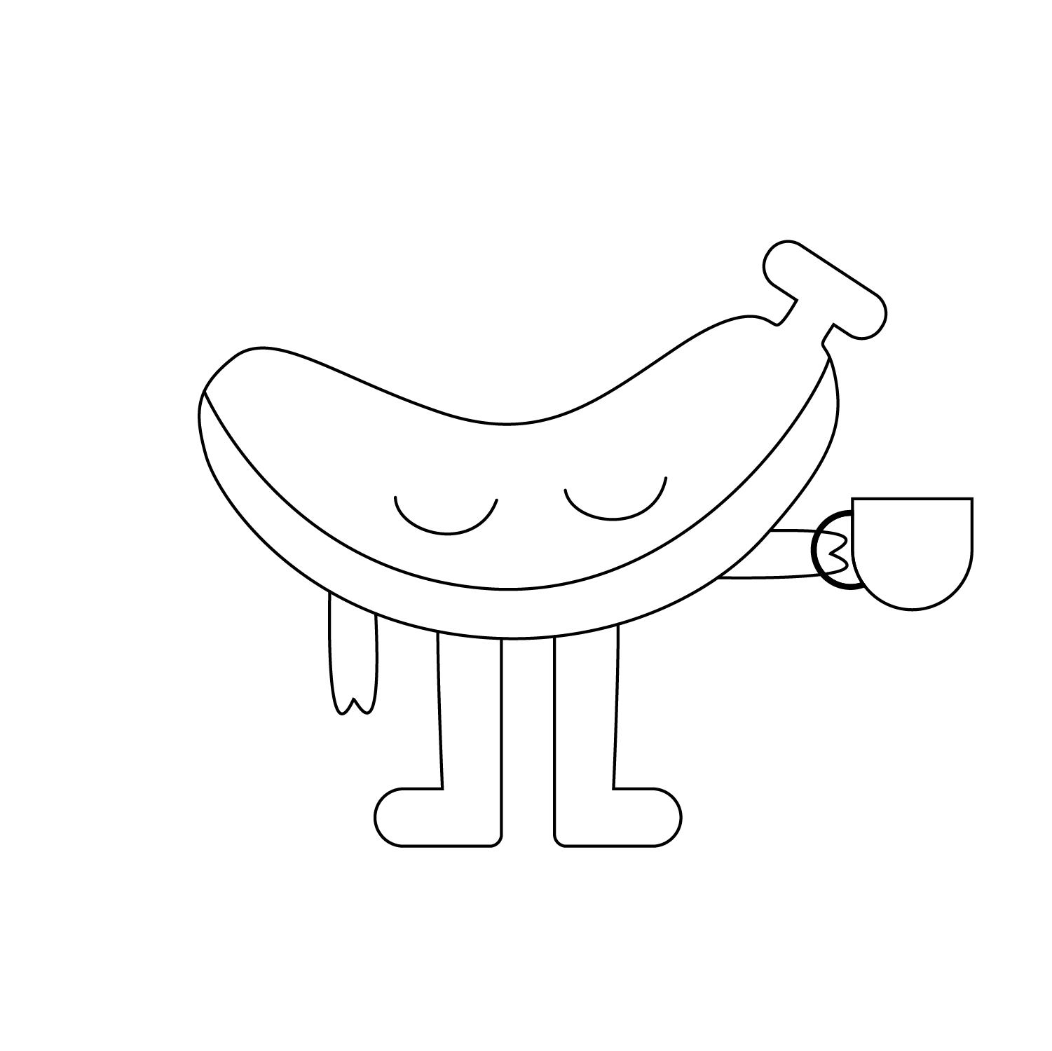
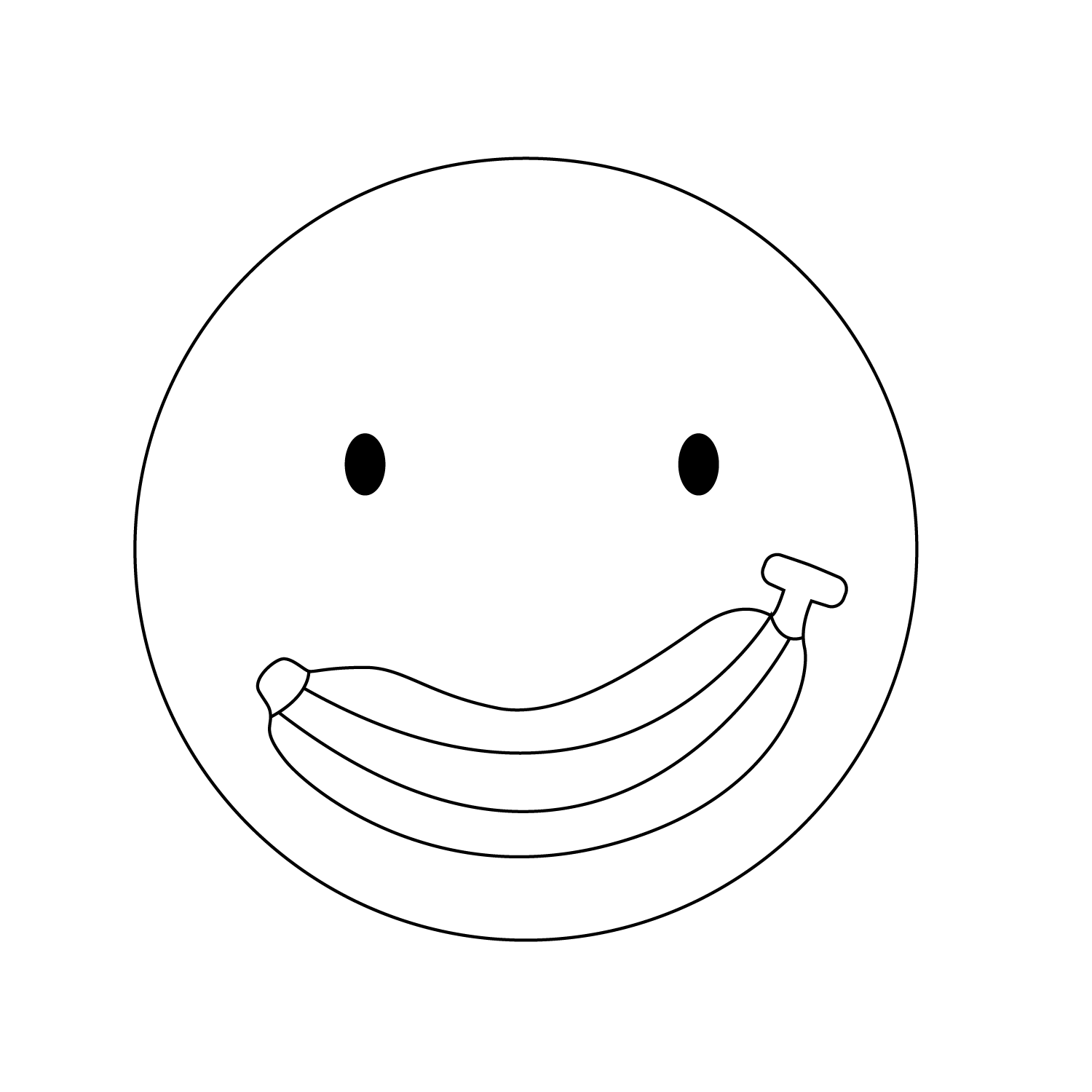
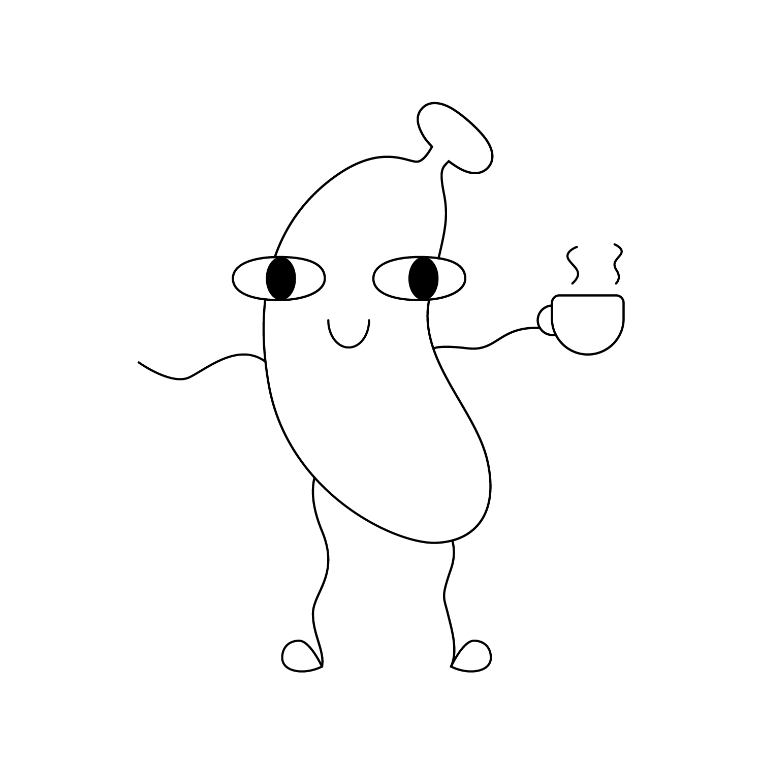
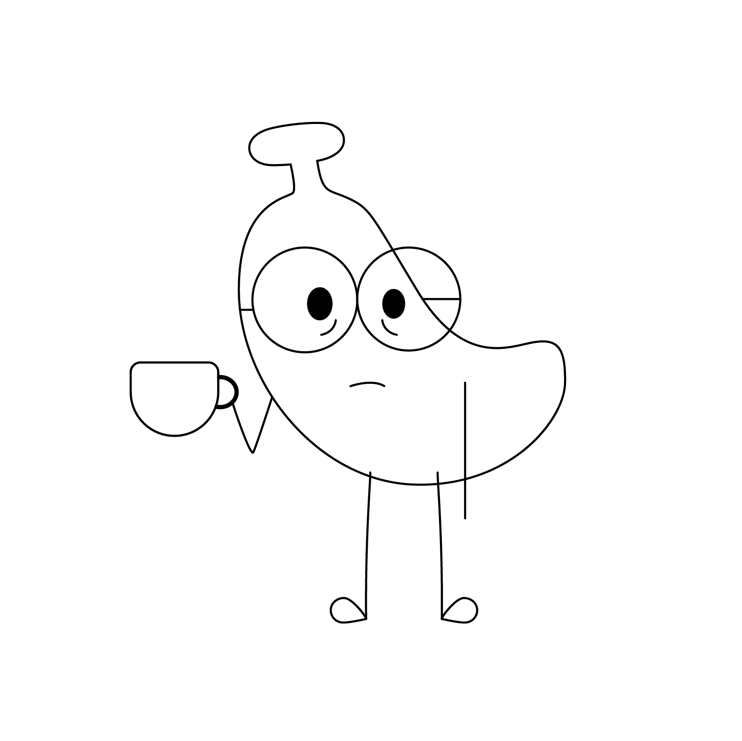
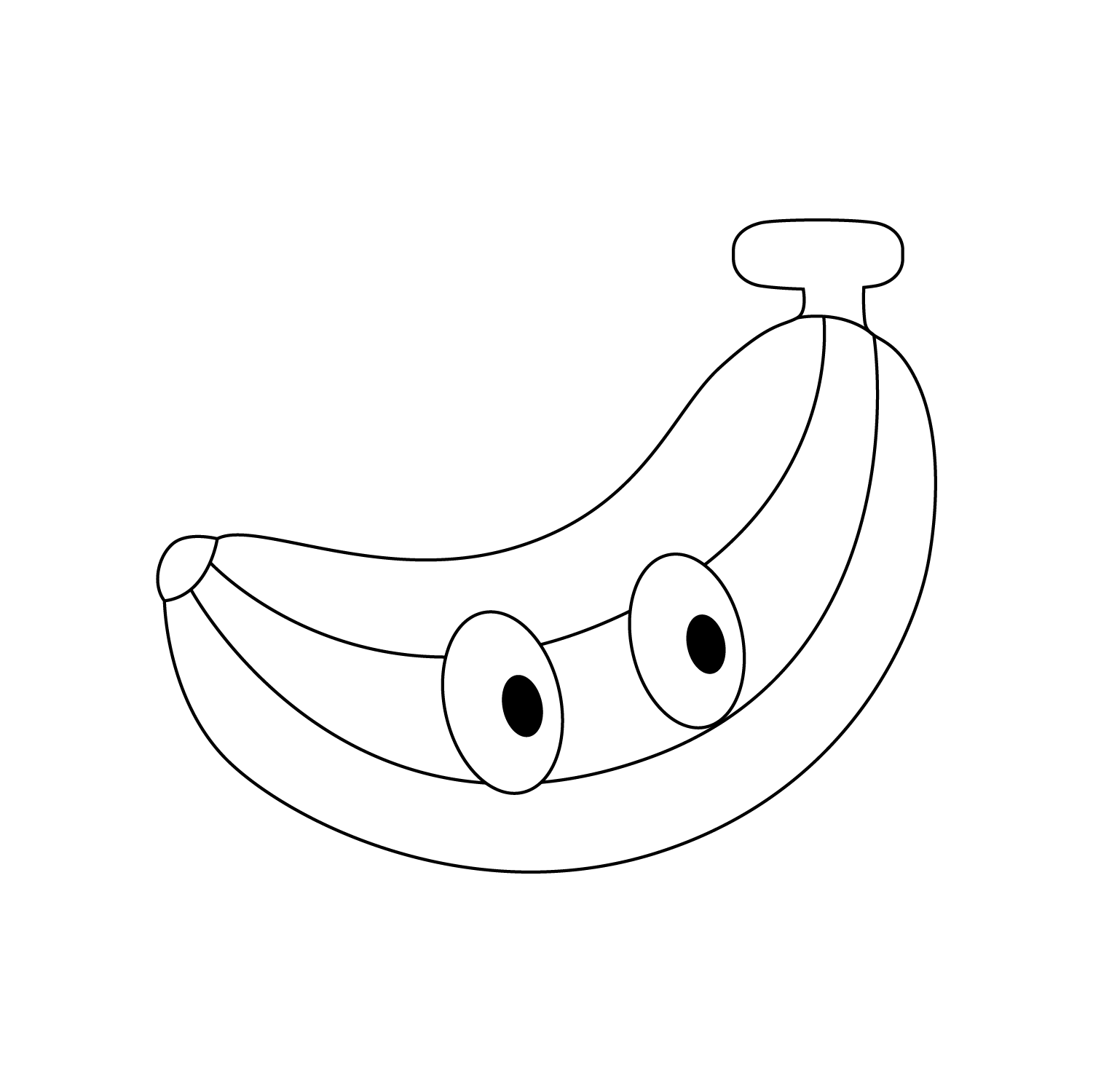
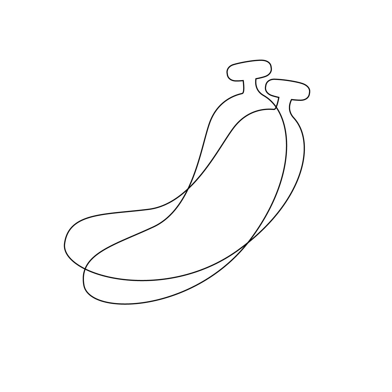
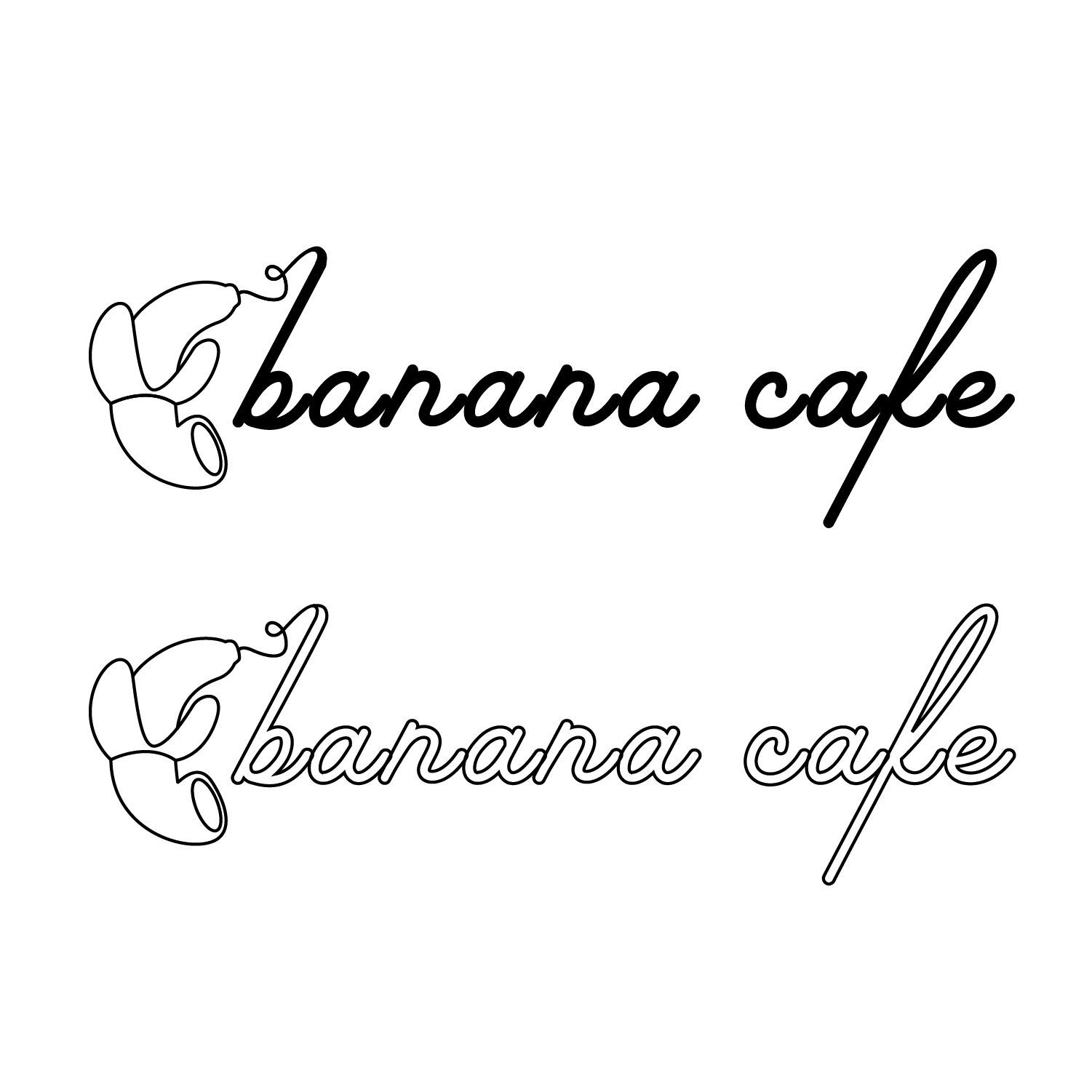
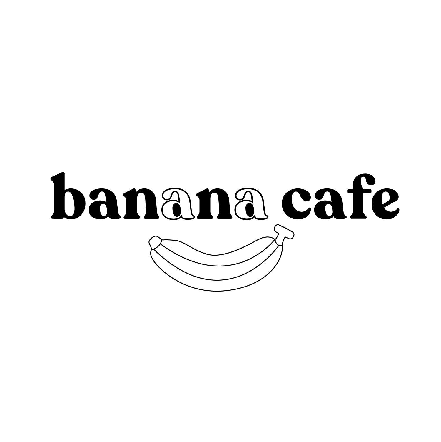
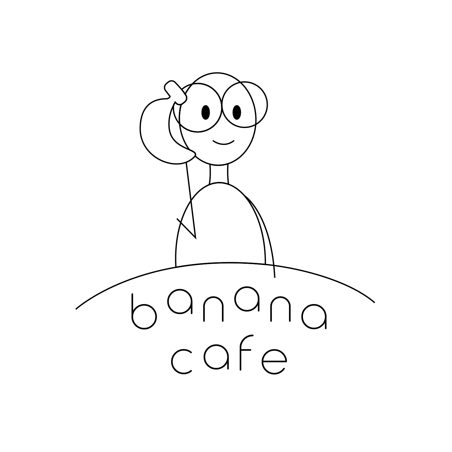
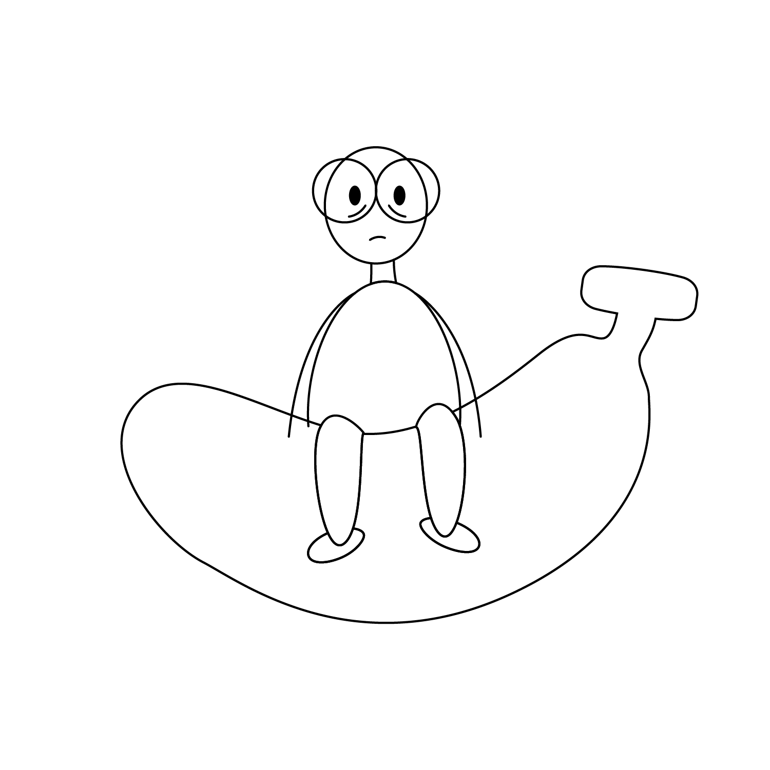
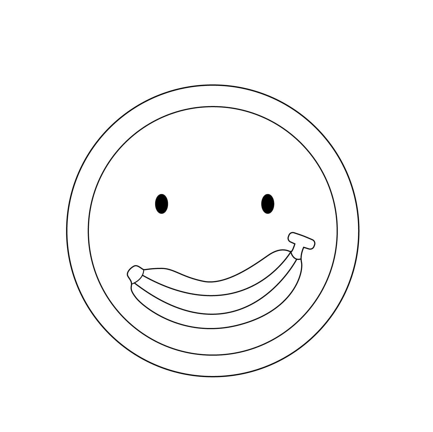
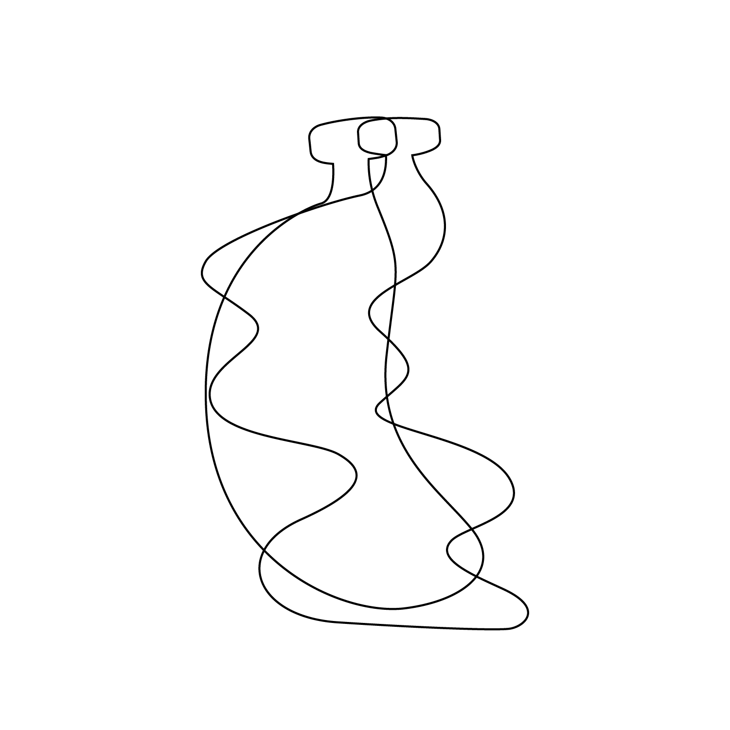
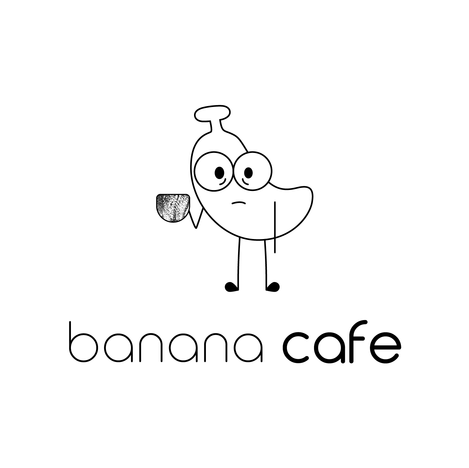
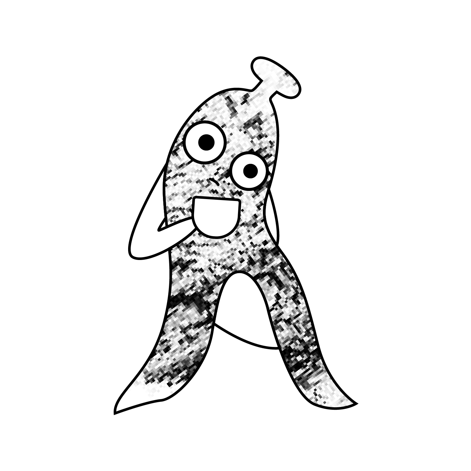
From the research, I began sketching logo ideas and vectorizing them in Illustrator. I tried multiple logo directions that closely resonate with existing Korean coffee shop aesthetics. After attempting monograms, wordmarks, combined, etc., I continued with a mascot/icon logo, since it aligns with what my audience seems to find appealing. I experimented with combining the logo with textures of the banana but I found the illustrative image to work best.


































BRANDING
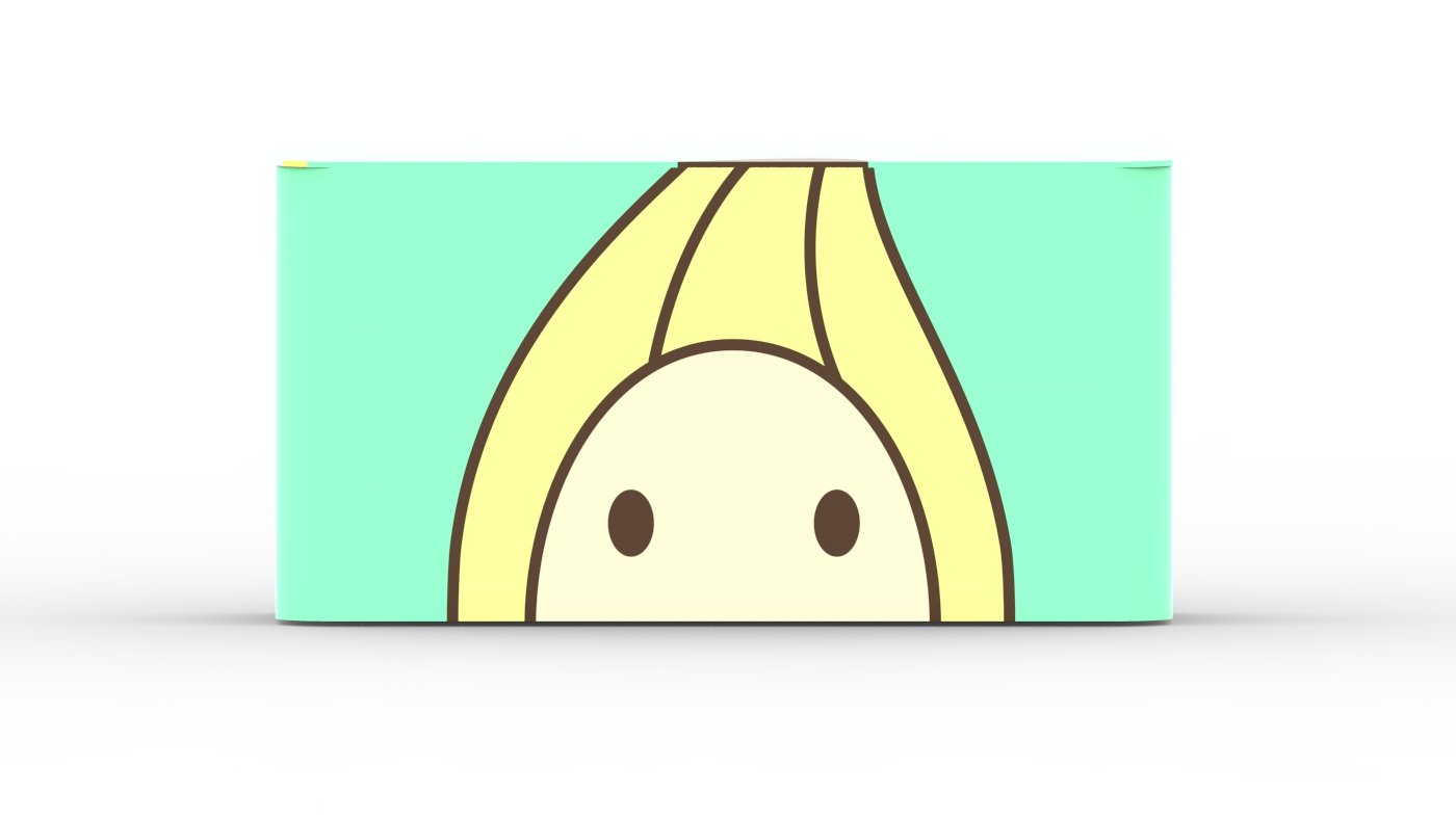
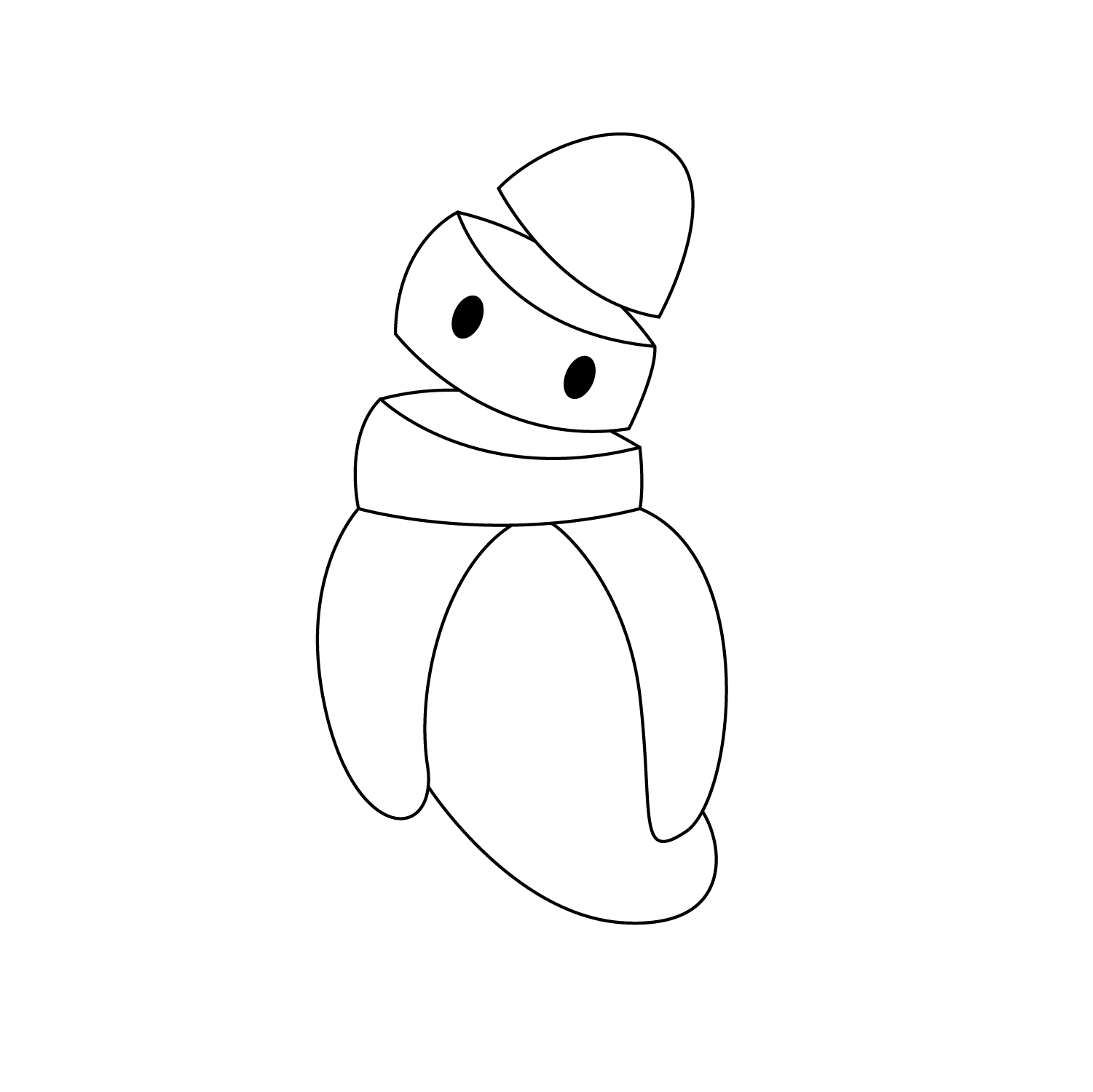
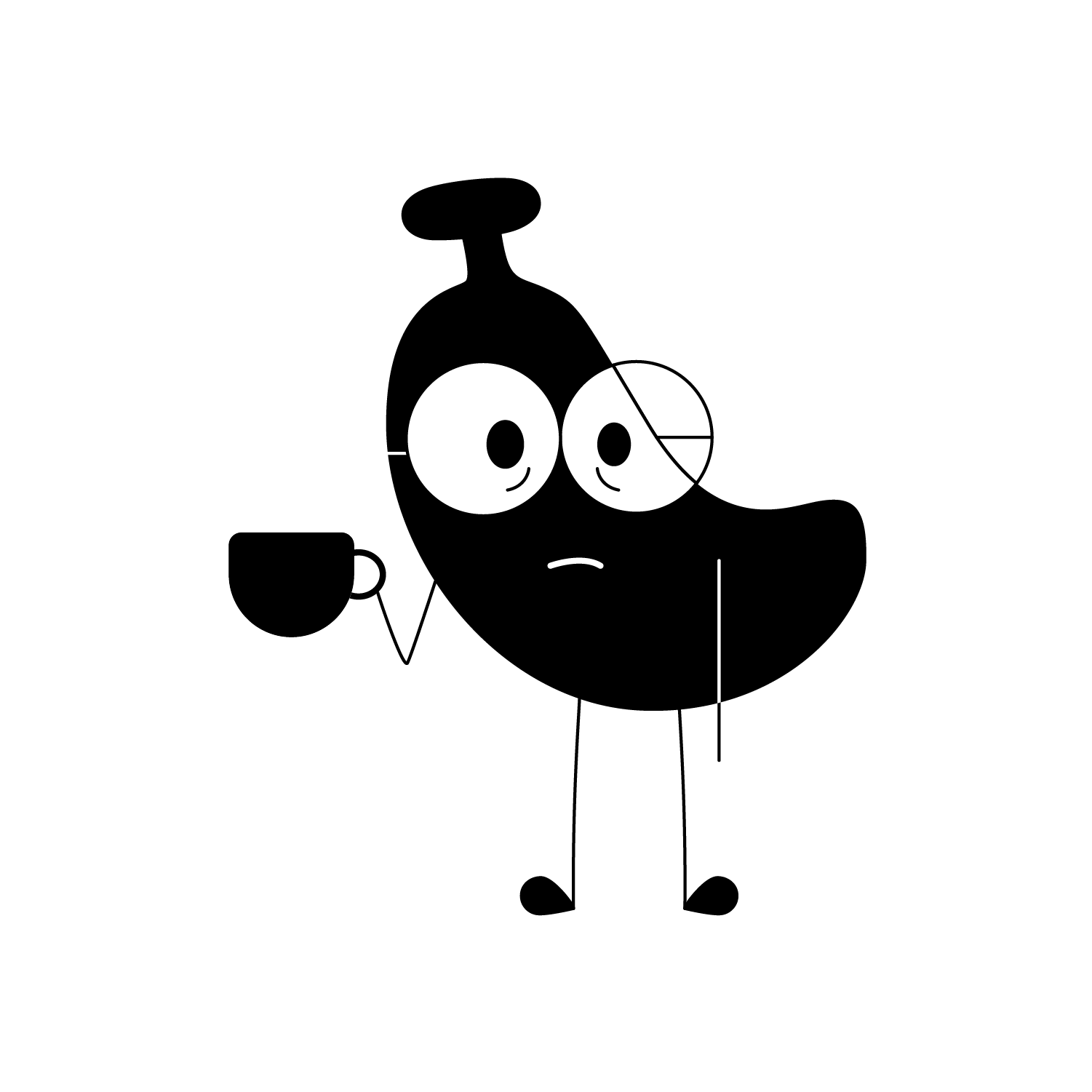
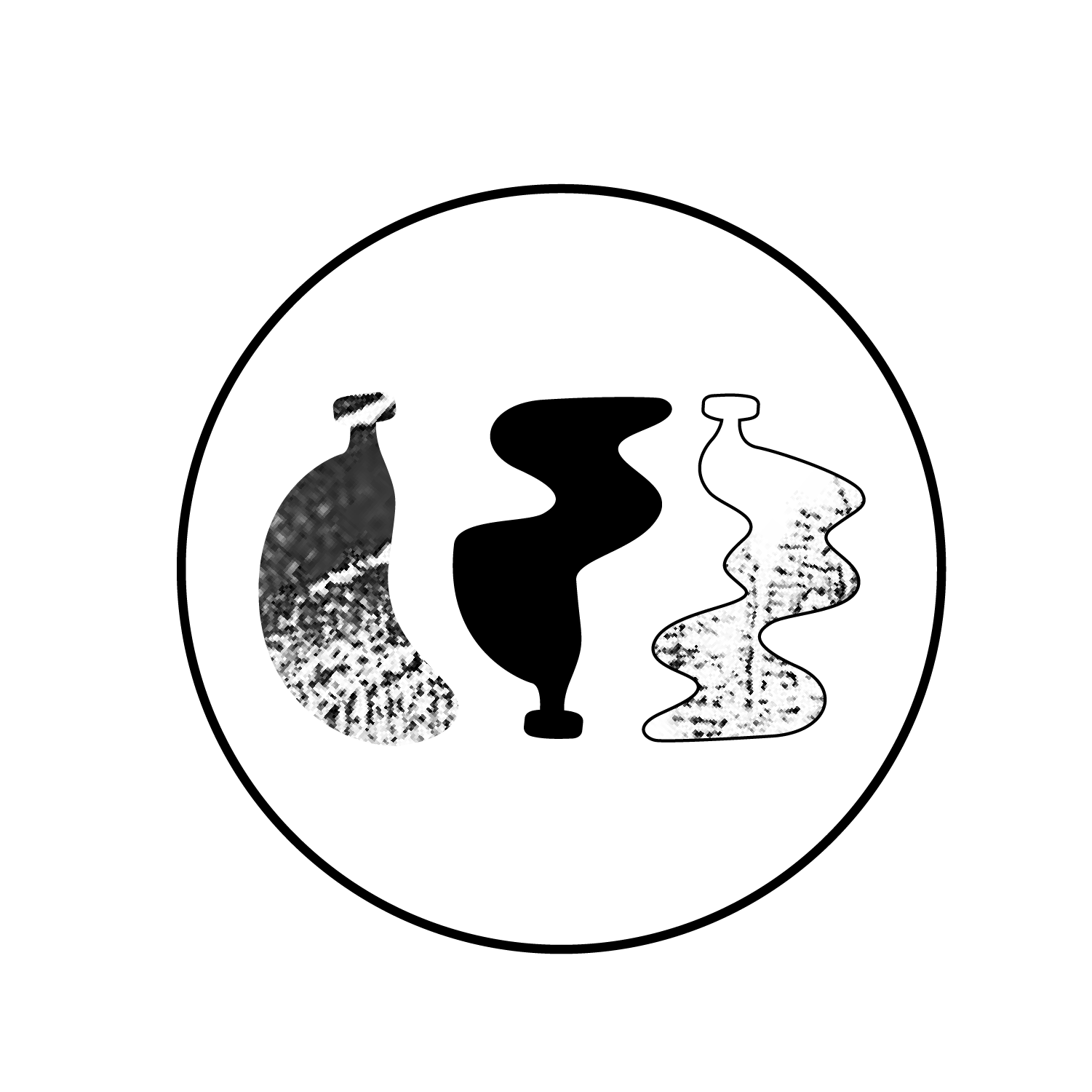
I continued with two character logos that I would mockup for round 1; however, for round 2, I decided to go with the banana head as the form was more versatile. The banana head represents separation, whereas the second direction represents the energizing property banana peels give.
UNBOXING EXPERIENCE
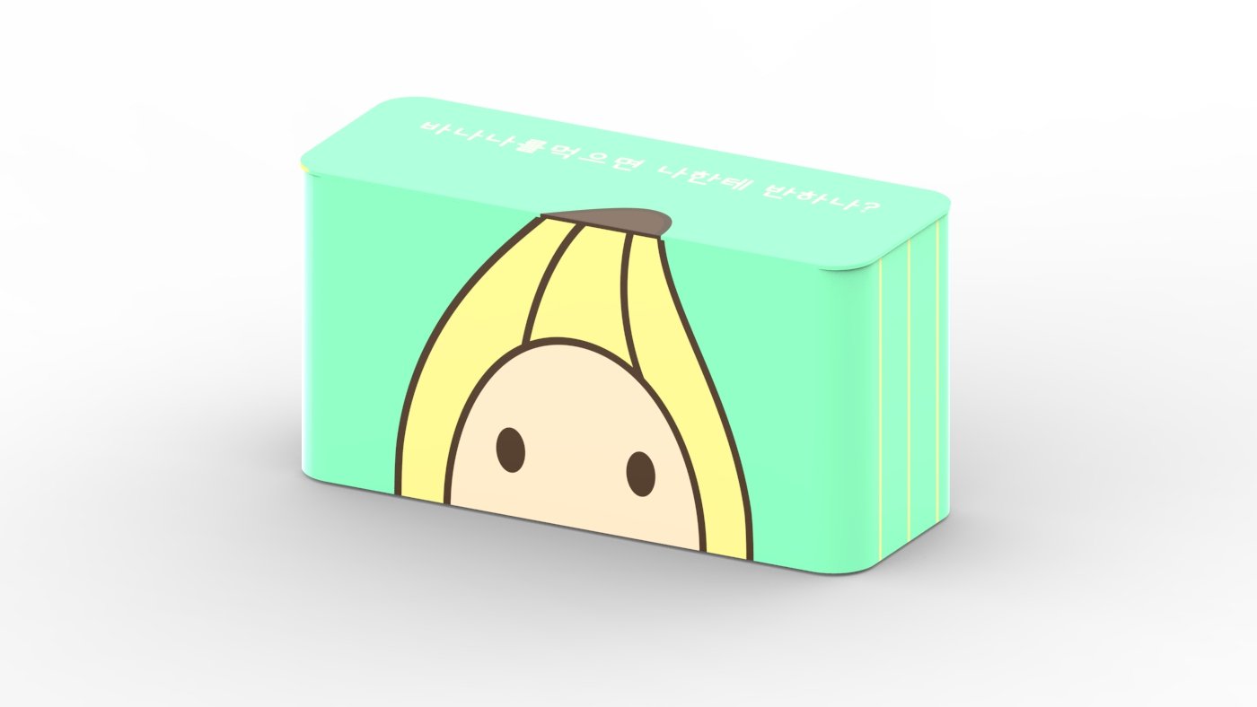
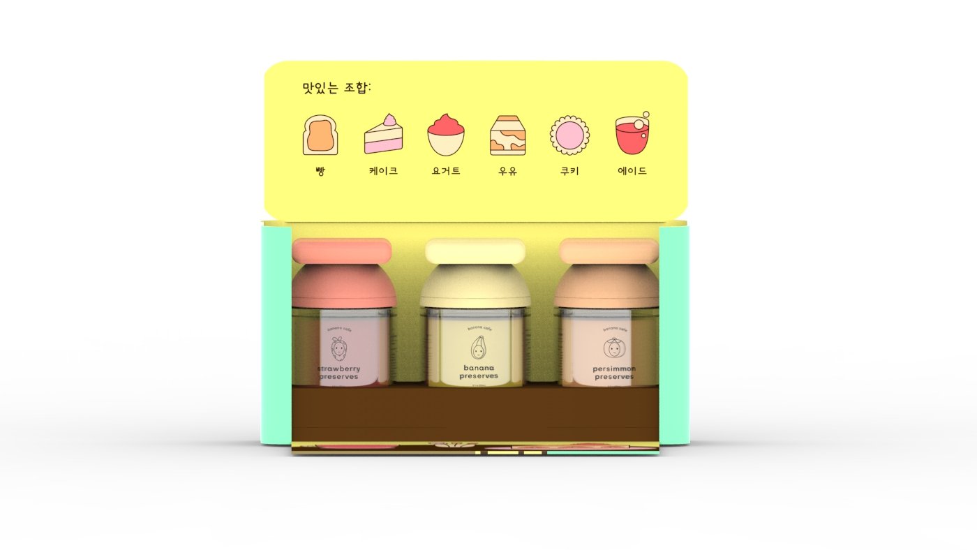
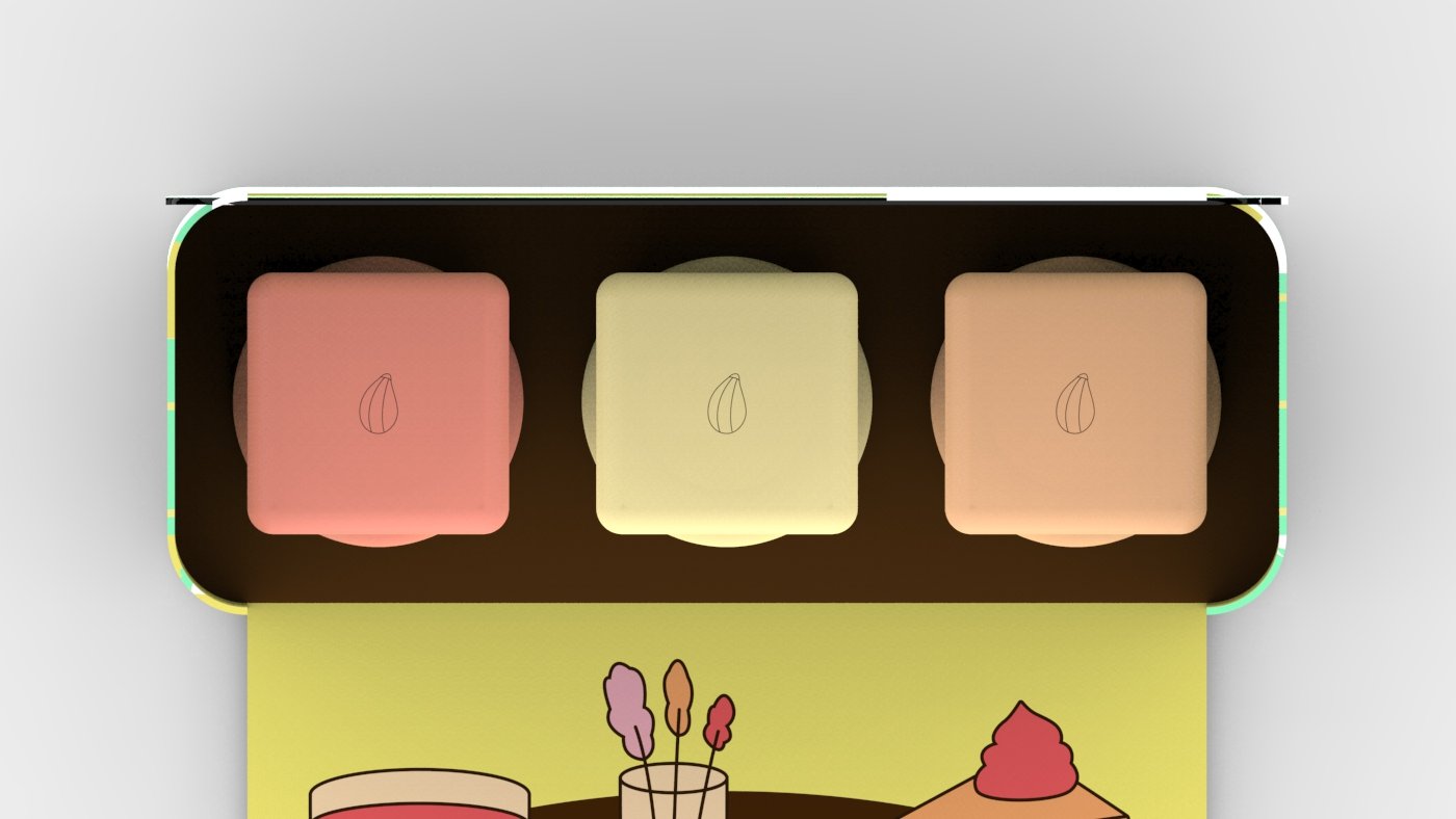
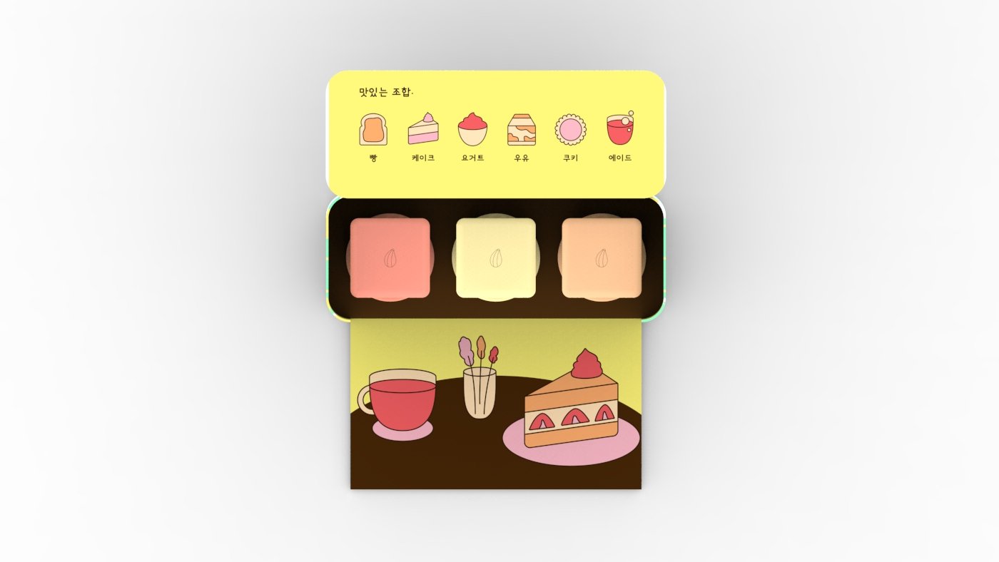
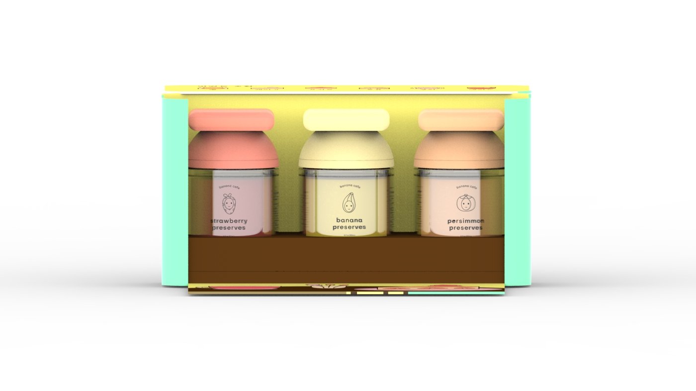
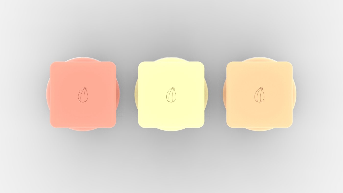
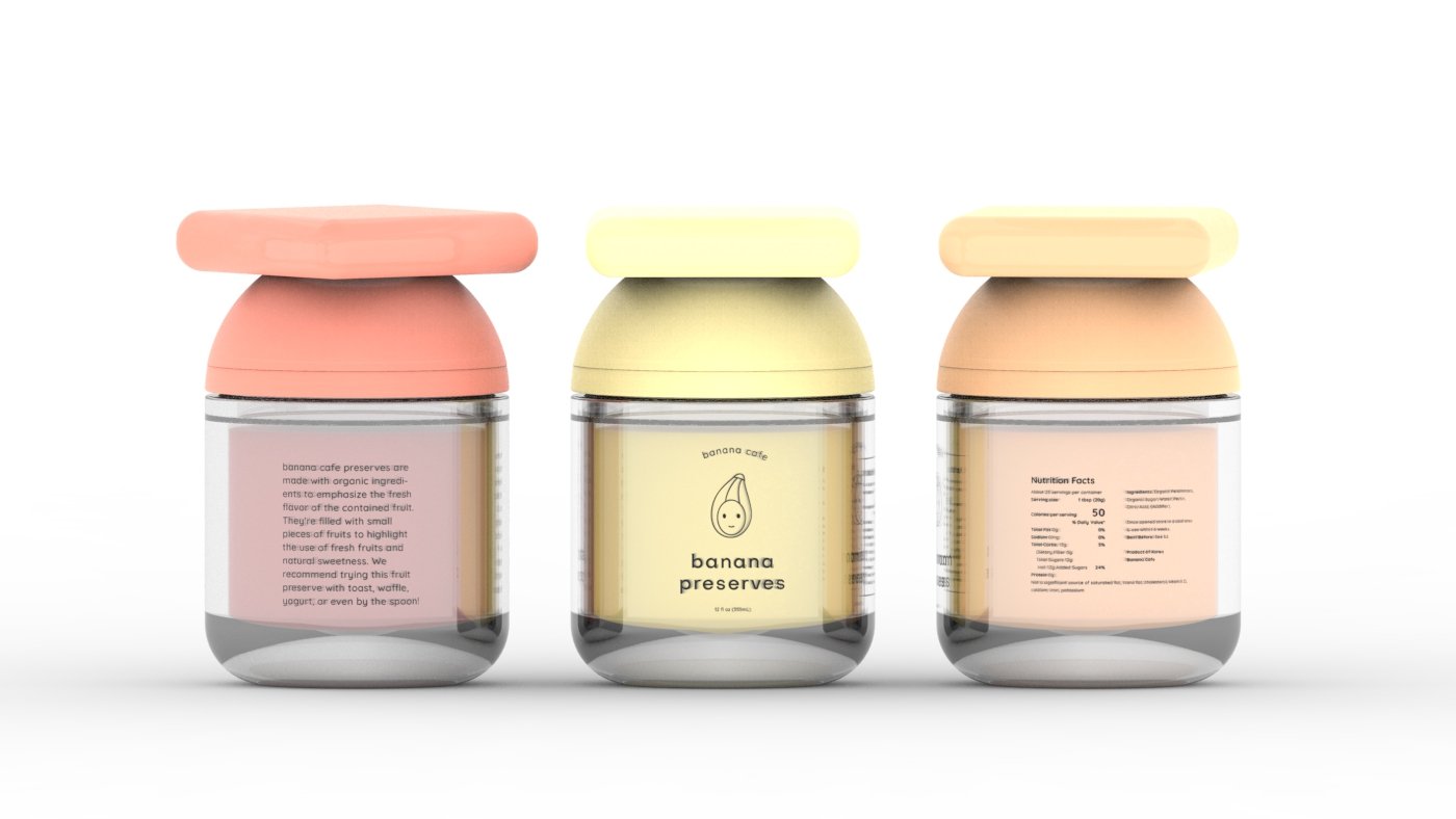
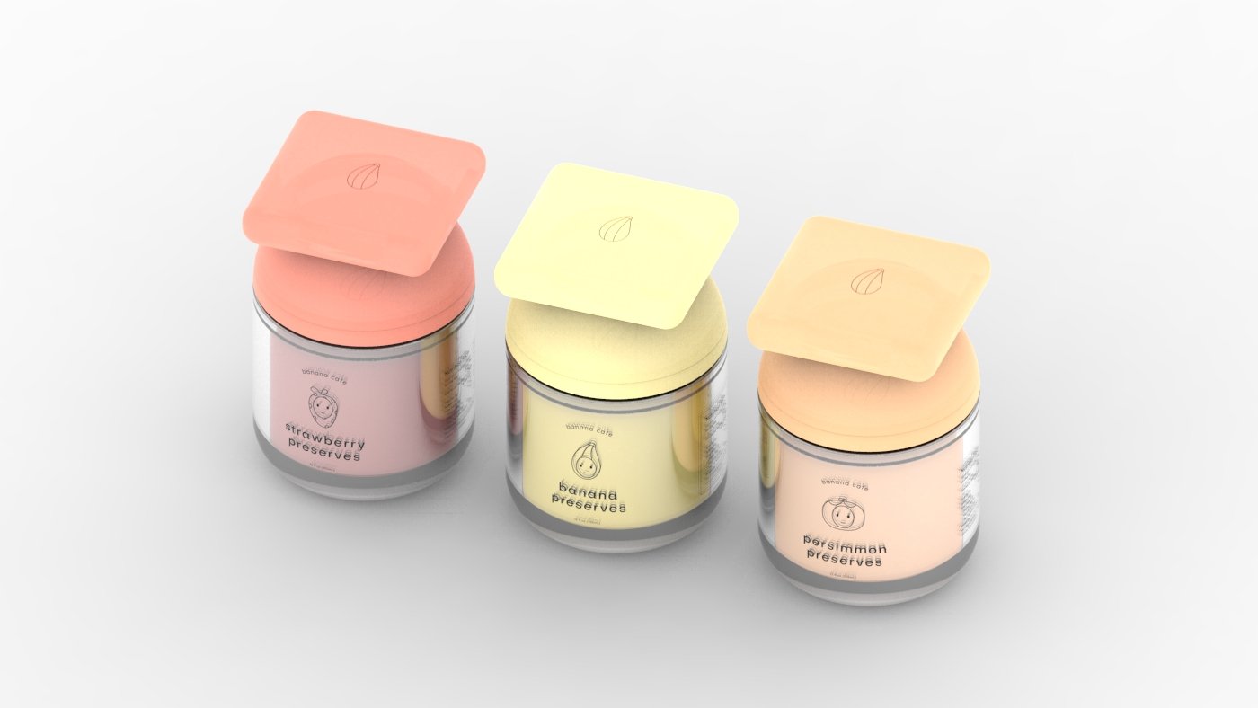
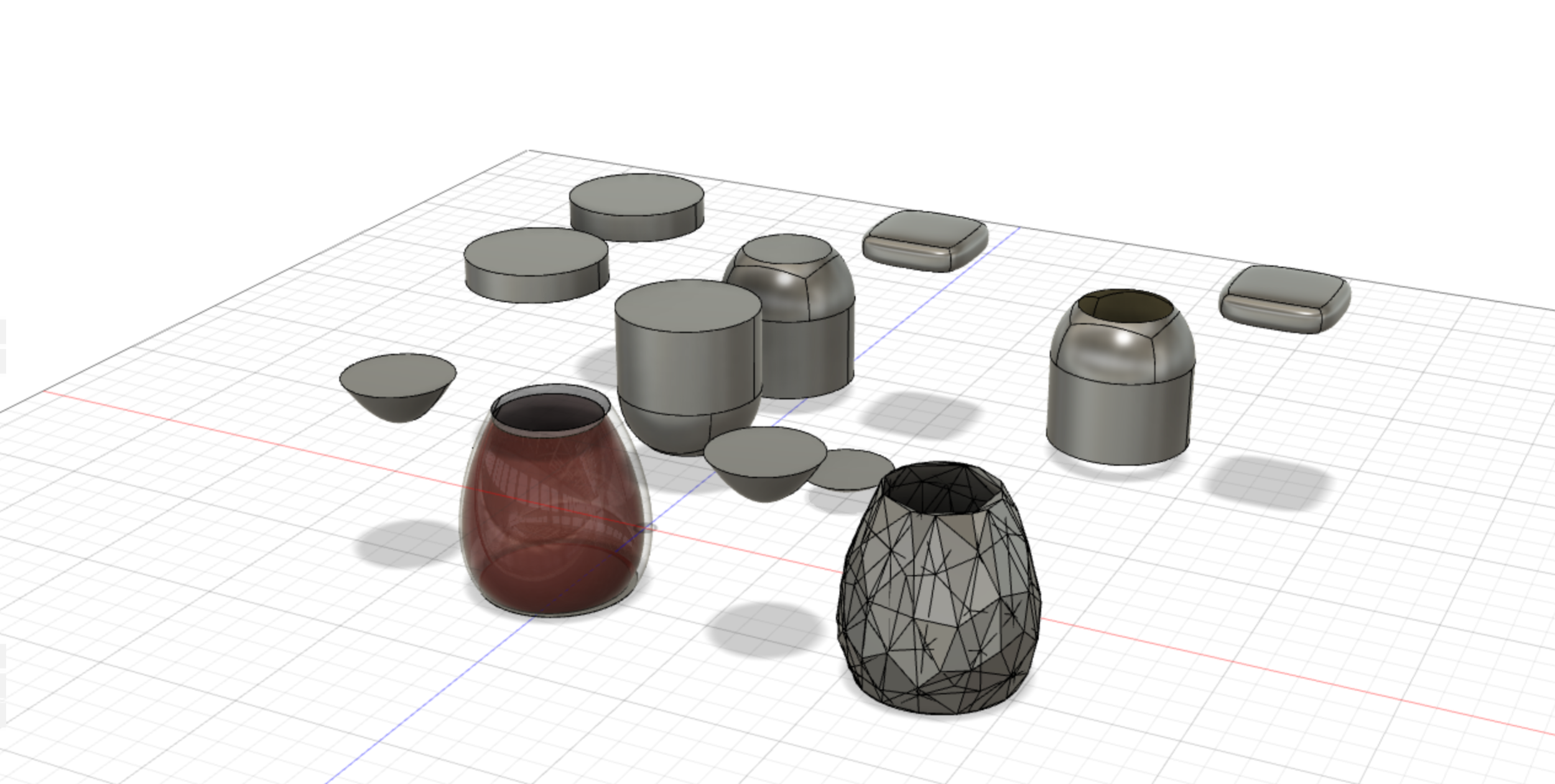
I expanded on this project to create an unboxing experience for preservatives that could be sold at the banana cafe. I decided to slightly lighten the color palette to match current-day Korean coffee shop aesthetics and I used the second logo direction to render a uniquely shaped bottle. The preservatives jar was inspired by the head of a banana.
